Replicating Facebook's Draggable Bottom Card using Auto Layout
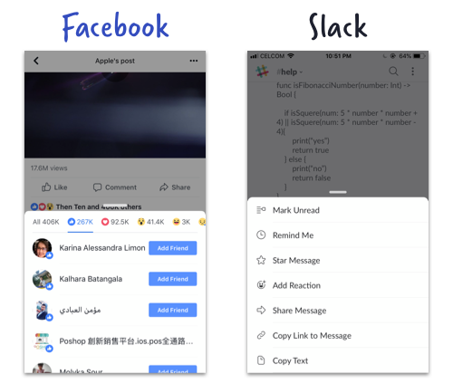
There's a popular trend in recent iOS apps which when user tap a button, a card-like modal will appear from the bottom and user can drag to expand, contract, or dismiss it. Facebook and Slack app uses this UI design :
In this tutorial, we will analyze how to implement the bottom card modal, and try to replicate it using modal presentation (ie. self.present(CardViewController)) , Pan Gesture, Storyboard and Auto Layout. This post assume you have some experience working with Auto Layout. There's other ways to do this such as implementing a custom UIViewController Transition
The end result (with dimming and draggable bottom modal) will look like this :
As the focus of this tutorial is implementing the bottom card modal view (not the Fake facebook status view shown above), I have created a starter project which contain the fake Facebook status view, you can get the starter project here : https://drive.google.com/open?id=1XktE9ZGey8vc0-Xf2y_uQwujI-2m3sVr
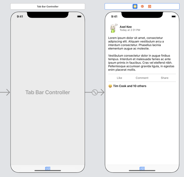
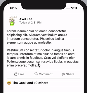
The starter project contains a fake Facebook Status View Controller (Status View Controller) embedded inside a tab bar controller.
You can use your own view / view controller if you don't want to use the facebook status view design. As long as your own View Controller has a UIButton that can activate the modal view controller on tap, the tutorial steps can be applied.
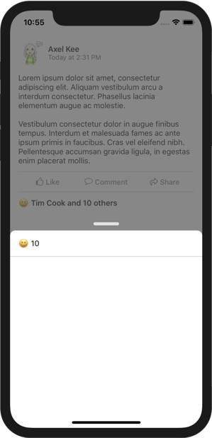
Build and run the starter project and you will see the fake Facebook Status View, tapping the "😆 Tim Cook and 10 others" button will call the reactionListButtonTapped() function inside StatusViewController.swift .
For the bottom modal card, we will create a view controller for it. Here's the big picture of the 7 main steps of this tutorial :
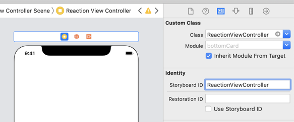
Create a new view controller (I named it as 'ReactionViewController', with a Storyboard ID of 'ReactionViewController' as well). Then the StatusViewController will present this new view controller modally, without animation.
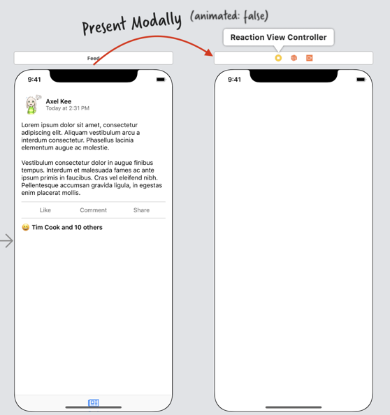
- Add an UIImageView to the Reaction View Controller, and pin it to the top, bottom, leading and trailing edges. Note that the top constraint is towards "Superview's Top" (the absolute top of the screen), not the safe area, same goes to the bottom constraint.
- Take snapshot of the StatusViewController (Fake Facebook Status View), which is an UIImage, and set the image view in ReactionViewController to use this snapshot image, to give an illusion of transition.
- Add a gray UIView (with alpha 0.7 ish) on top of the image view, to serve as a dimmer view. Add a tap gesture recognizer on this gray view, when user tap on it, dismiss the ReactionViewController to go back to the StatusViewController.
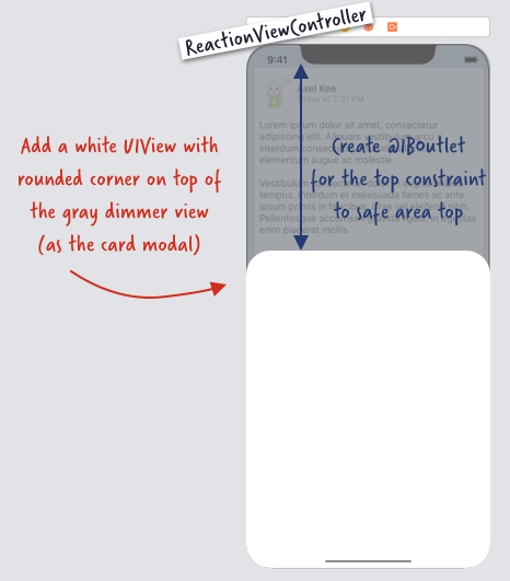
- Add a white UIView on top of the gray dimmer view, round the top left and top right corners. This is the card view we will use to display content. Create an IBOutlet for the top constraint from the card view top to the Safe Area Top.
- Add a pan gesture recognizer on the ReactionViewController root view (i.e self.view) , and use code to change the top constraint constant value based on the distance panned by the user. i.e: when user drag finger up, the card view will expand upwards, when user drag finger down, the card view will contract downwards.
- Add the handle view on top of the card view and also any additional content on the card as you like!
There's all to it! Most of the complex coding is on step 6 (manipulating the top constraint constant value based on the pan gesture).
Without further ado, let's start the tutorial!
Create ReactionViewController with backing Image View and gray dimmer View
Open the starter project, create a new ViewController file , and name it as "ReactionViewController". Next, open the Main.storyboard, drag a new view controller into the storyboard, set its class to ReactionViewController and set its Storyboard ID to 'ReactionViewController' (same name as the class).
Next, open "StatusViewController.swift", find the function @IBAction func reactionListButtonTapped(). This function is fired when the "Tim Cook and 10 others" reaction button on the status view is tapped.
We want to present the ReactionViewController modally when this button is tapped, add the following code inside the function :
x@IBAction func reactionListButtonTapped(_ sender: UIButton) { guard let reactionVC = storyboard?.instantiateViewController(withIdentifier: "ReactionViewController") as? ReactionViewController else { assertionFailure("No view controller ID ReactionViewController in storyboard") return } // present the view controller modally without animation self.present(reactionVC, animated: false, completion: nil)}If we present a view controller modally with animated set to true, iOS will use a default animation of moving the new controller from the bottom edge to the top. We don't want this animation as we are going to replace it with our own card modal animation.
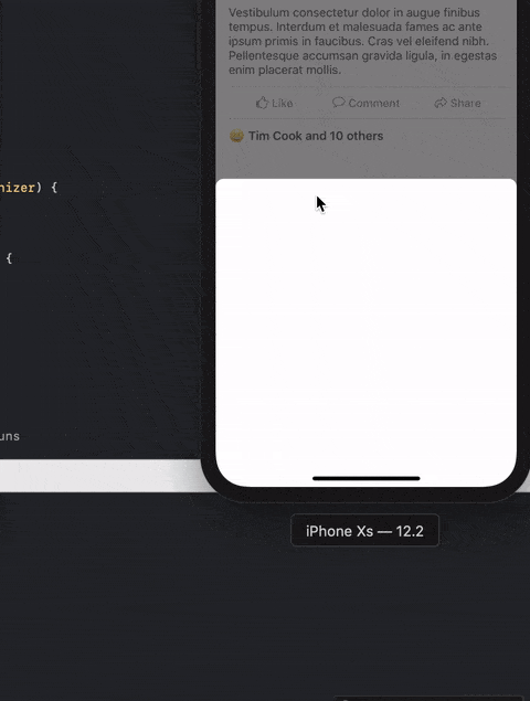
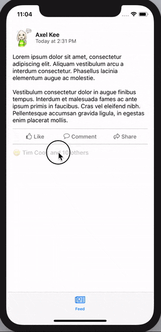
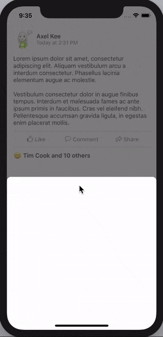
Build and run the project, when you tap on the button, you will see a blank view controller appear immediately like this :
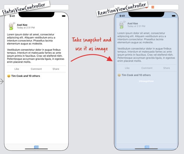
As the blank view controller looks very different than the previous view controller, this might give user a sudden shock. To smoothen the transition, we will take a snapshot of the previous view controller, and put the snapshot image as the background of the new view controller (ReactionViewController), so that user won't notice that there is a transition of view controllers.
To capture an image snapshot of a view, we will use UIGraphicsImageRenderer class provided by Apple to render the UIView as an image. Create a new Swift file, name it as "UIView+Snapshot.swift", then add an extension to the UIView class like this :
xxxxxxxxxx// UIView+Snapshot.swiftimport UIKitextension UIView { // render the view within the view's bounds, then capture it as image func asImage() -> UIImage { let renderer = UIGraphicsImageRenderer(bounds: bounds) return renderer.image({ rendererContext in layer.render(in: rendererContext.cgContext) }) }}
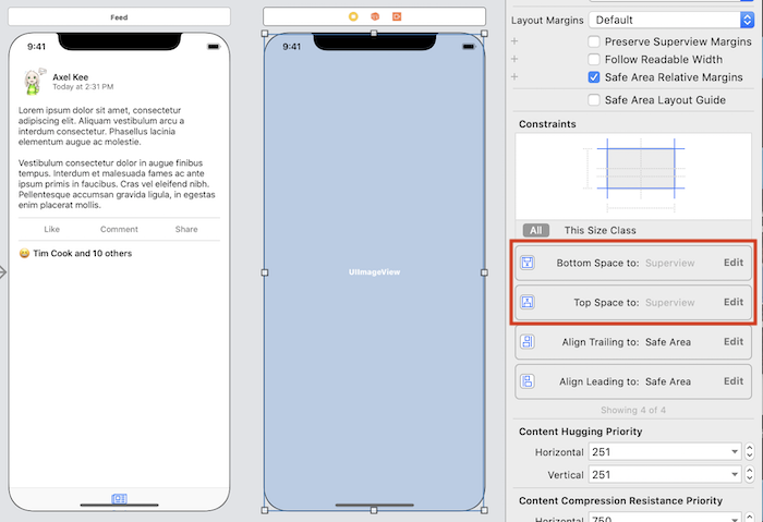
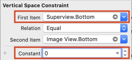
Next, we will place an UIImageView on the ReactionViewController, this image view will use the image snapshot we captured earlier on. Drag an UIImageView into ReactionViewController, then set top, bottom, leading and trailing constraint to 0 like this :
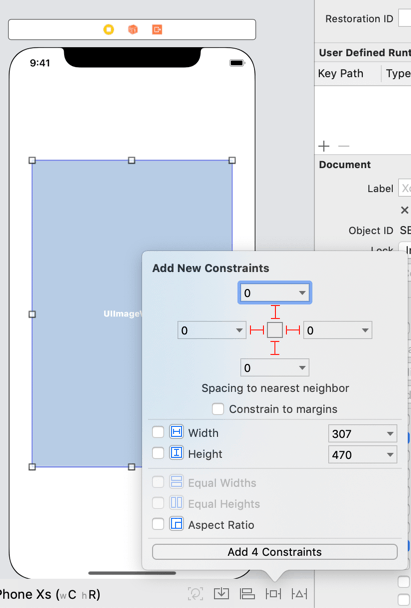
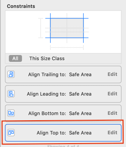
By default Xcode will set the top and bottom constraint to the Safe Area (the rectangular area not hidden by the notch and rounded corner of the phone screen). We want the image view to cover the whole screen including the rounded corner of the phone screen, to do this, open the Size inspector tab to list all constraints for the image view.
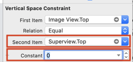
Double click the Top constraint:
In the First Item or Second Item, change the SafeArea.Top to SuperView.Top, and after changing, set the constant to 0.
Do the same for the bottom constraint, change the SafeArea.Bottom to SuperView.Bottom, and set the constant to 0.
After setting both top and bottom constraint to compare against superview, the UIImageView should look like this in the view controller :
Next, create an IBOutlet for this image view, an declare an UIImage variable to store the snapshot image, in ReactionViewController.swift :
xxxxxxxxxx// ReactionViewController.swiftclass ReactionViewController: UIViewController { @IBOutlet weak var backingImageView: UIImageView! // to store backing (snapshot) image var backingImage: UIImage? override func viewDidLoad() { super.viewDidLoad() // update the backing image view backingImageView.image = backingImage } }Don't forget to update the imageview's image in viewDidLoad as well.
Now in the StatusViewController, we can capture the snapshot of its view right when the button is tapped, instantiate the ReactionViewController, and pass the snapshot image to the backingImage variable.
xxxxxxxxxx// StatusViewController.swift@IBAction func reactionListButtonTapped(_ sender: UIButton) { guard let reactionVC = storyboard?.instantiateViewController(withIdentifier: "ReactionViewController") as? ReactionViewController else { assertionFailure("No view controller ID ReactionViewController in storyboard") return } // take a snapshot of current view and set it as backingImage reactionVC.backingImage = self.view.asImage() // present the view controller modally without animation self.present(reactionVC, animated: false, completion: nil)}
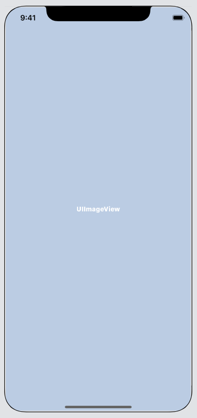
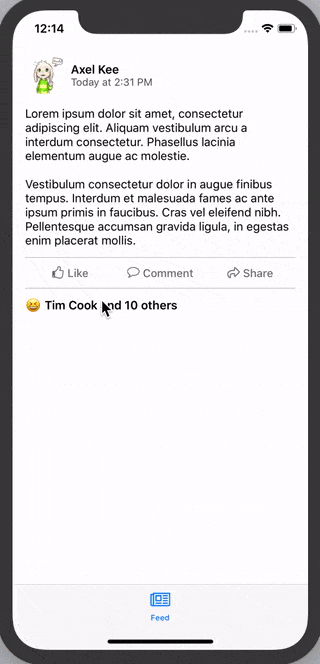
Build and run the project, tap the button and you will see that nothing has changed after tapping button, it means that the snapshot image is being shown correctly! The ReactionViewController has presented modally and its backing image view is using the snapshot captured on StatusViewController.
Upon closer inspection, the snapshotted image didn't have tab bar?! 😱
The snapshot from self.view.asImage() in StatusViewController doesn't contain tab bar, this is because StatusViewController is embedded inside Tab Bar Controller, hence calling capture on itself doesn't capture UI outside of its bounds. To fix this, we should call self.tabBarController?.view.asImage() instead, to capture the whole view including tab bar.
xxxxxxxxxx// StatusViewController.swift@IBAction func reactionListButtonTapped(_ sender: UIButton) { guard let reactionVC = storyboard?.instantiateViewController(withIdentifier: "ReactionViewController") as? ReactionViewController else { assertionFailure("No view controller ID ReactionViewController in storyboard") return } // capture the whole view including tab bar reactionVC.backingImage = self.tabBarController?.view.asImage() self.present(reactionVC, animated: false, completion: nil)}
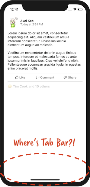
Build and run the project again, this time the tab bar is there after pressing the button! But wait, the button seems faded out?
On default UIKit setting, when a button is being tapped, it will fade out for a while before restoring back the original opacity. As the snapshot is captured immediately right after user tap the button, the button is still in its faded out state during the capture.
One of the way to solve this is to delay the capture of the snapshot and subsequently the modal presentation, we can use DispatchQueue to delay the execution of screen capture like this :
xxxxxxxxxx// StatusViewController.swift@IBAction func reactionListButtonTapped(_ sender: UIButton) { guard let reactionVC = storyboard?.instantiateViewController(withIdentifier: "ReactionViewController") as? ReactionViewController else { assertionFailure("No view controller ID ReactionViewController in storyboard") return } // Delay the capture of snapshot by 0.1 seconds DispatchQueue.main.asyncAfter(deadline: .now() + 0.1 , execute: { // take a snapshot of current view and set it as backingImage reactionVC.backingImage = self.tabBarController?.view.asImage() // present the view controller modally without animation self.present(reactionVC, animated: false, completion: nil) })}
Build and run the project, now we have implemented an illusion which user feel like they are still on the same view controller despite ReactionViewController has been presented modally!
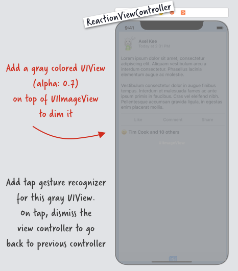
Next, we will put a dimmer view on top of the backing image view in ReactionViewController. Apply the same top, bottom (to superview instead of safe area), leading and trailing constraints for the dimmer view as well.
Set the background color of the dimmer view to Dark Gray (or any other darker color you want), then set the alpha to 0.7 . Your storyboard should look like this now :
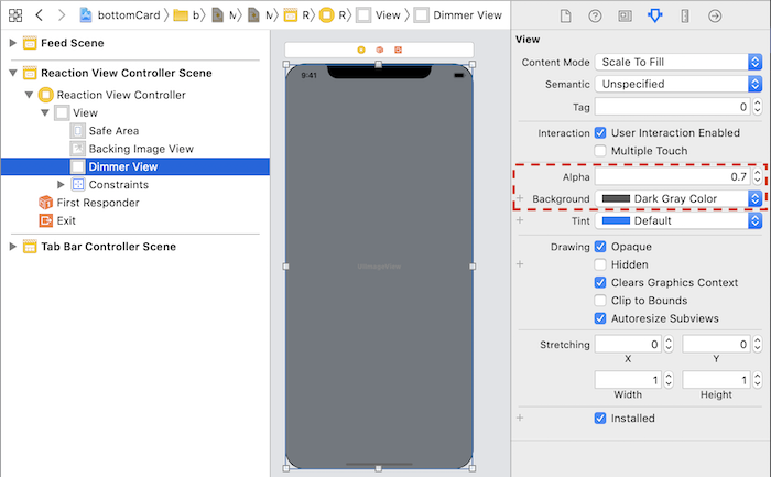
Next, create an IBOutlet for this dimmer view in ReactionViewController, we can name it as dimmerView .
xxxxxxxxxx// ReactionViewController.swiftclass ReactionViewController: UIViewController { @IBOutlet weak var backingImageView: UIImageView! @IBOutlet weak var dimmerView: UIView! // to store backing (snapshot) image var backingImage: UIImage? // ...}
Now we have the dimmer view, it's time to put the actual card view on the ReactionViewController. Drag a new UIView onto the view controller, place it on top of the dimmer view, then add the constraints like this :
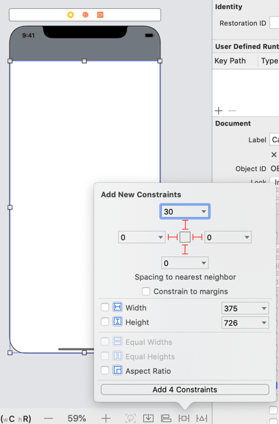
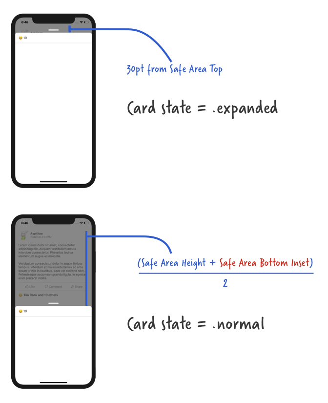
The bottom constraint of the card view should be relative to the Superview bottom (same as previous dimmer view), but the top constraint of the card view should be relative to the SafeArea top, and with a constant number (I have set it to 30) :
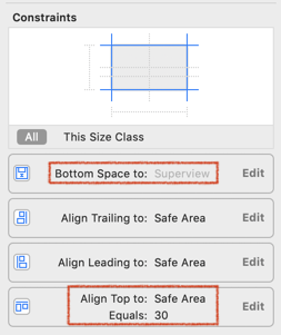
Next, create an IBOutlet for the card view and the top constraint of the card view, you can name the IBOutlet for the card view as cardView.
To create an IBOutlet for the top constraint, double click the top constraint in the constraint list, then Xcode will highlight the constraint on the Document Outline, then press and hold Control and drag it to the view controller's code.
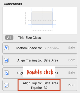
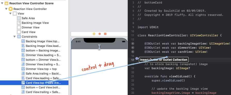
I have named the top constraint IBOutlet as cardViewTopConstraint . Your ReactionViewController.swift file should look like this now :
xxxxxxxxxx// ReactionViewControllerclass ReactionViewController: UIViewController { @IBOutlet weak var backingImageView: UIImageView! @IBOutlet weak var dimmerView: UIView! @IBOutlet weak var cardView: UIView! @IBOutlet weak var cardViewTopConstraint: NSLayoutConstraint! // to store backing (snapshot) image var backingImage: UIImage? override func viewDidLoad() { super.viewDidLoad() // update the backing image view backingImageView.image = backingImage }}
As the top left and top right corner of the card view is rounded, we can round them like this :
xxxxxxxxxx// ReactionViewController.swiftoverride func viewDidLoad() { super.viewDidLoad() // update the backing image view backingImageView.image = backingImage // round the top left and top right corner of card view cardView.clipsToBounds = true cardView.layer.cornerRadius = 10.0 cardView.layer.maskedCorners = [.layerMinXMinYCorner, .layerMaxXMinYCorner]}
Now build and run the project, tap the button, you will see the card view presented suddenly with dimmer view. Next, we want the card view to appear from the bottom smoothly and the dimmer view slowly become darker when the button is tapped.
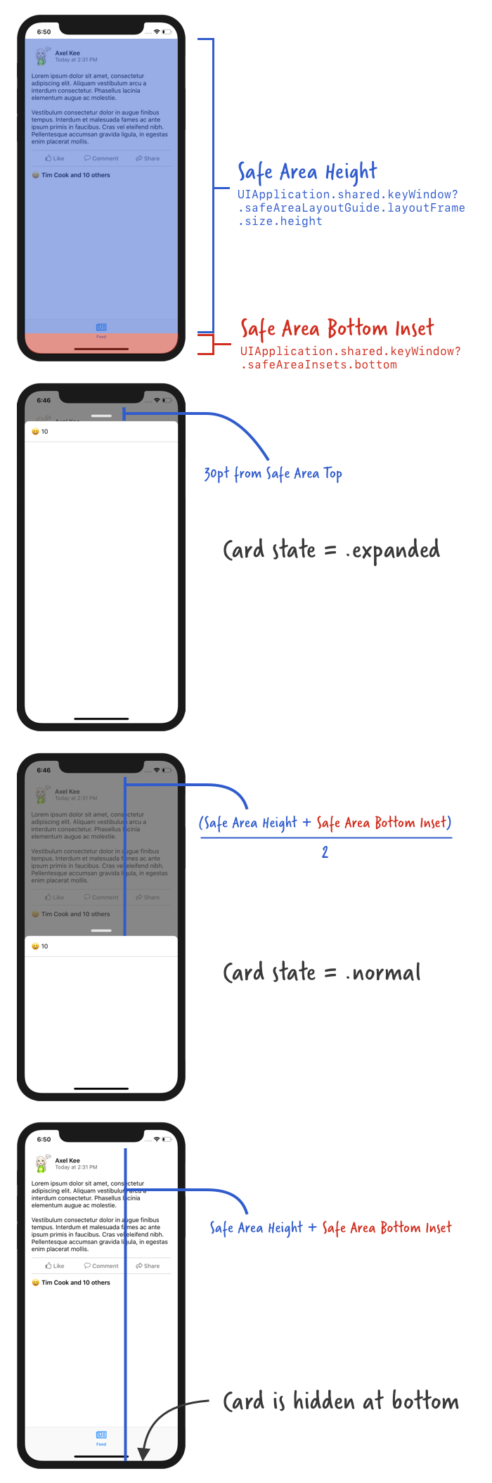
Before proceeding to the code, let's take a look at the card view. There's two state for the card, I will name them as .normal and .expanded. Here's the top constraint value for when the card is expanded, normal and hidden (it is placed below the screen area before moving up) :
When user tap on the button, the card should be hidden at bottom at first, then slowly move up. Same goes to the dimmer view, the view should slowly transition from transparent to gray dim.
Let's move the card to below the screen and set the dimmer view to transparent like this :
xxxxxxxxxx// ReactionViewController.swiftoverride func viewDidLoad() { super.viewDidLoad() // update the backing image view backingImageView.image = backingImage // round the top left and top right corner of card view cardView.clipsToBounds = true cardView.layer.cornerRadius = 10.0 cardView.layer.maskedCorners = [.layerMinXMinYCorner, .layerMaxXMinYCorner] // hide the card view at the bottom when the View first load if let safeAreaHeight = UIApplication.shared.keyWindow?.safeAreaLayoutGuide.layoutFrame.size.height, let bottomPadding = UIApplication.shared.keyWindow?.safeAreaInsets.bottom { cardViewTopConstraint.constant = safeAreaHeight + bottomPadding } // set dimmerview to transparent dimmerView.alpha = 0.0}
We make the top constraint constant value of the card view to equal to safe area height + bottom insets of safe area, so that the card will be hidden below.
Next, we are going to implement the animation where the card move up from the bottom to the .normal state, and the dimmer view become dim (gray, alpha = 1.0) from transparent. This animation is shown when the ReactionViewController's view appears, hence we will put the animation code in viewDidAppear().
xxxxxxxxxx// ReactionViewController.swiftoverride func viewDidAppear(_ animated: Bool) { super.viewDidAppear(animated) showCard()}//MARK: Animationsprivate func showCard() { // move card up from bottom // show dimmer view}
Next, we are going to implement the animations in showCard() function using Property Animators .
xxxxxxxxxx// ReactionViewController.swift//MARK: Animationsprivate func showCard() { // ensure there's no pending layout changes before animation runs self.view.layoutIfNeeded() // set the new top constraint value for card view // card view won't move up just yet, we need to call layoutIfNeeded() // to tell the app to refresh the frame/position of card view if let safeAreaHeight = UIApplication.shared.keyWindow?.safeAreaLayoutGuide.layoutFrame.size.height, let bottomPadding = UIApplication.shared.keyWindow?.safeAreaInsets.bottom { // when card state is normal, its top distance to safe area is // (safe area height + bottom inset) / 2.0 cardViewTopConstraint.constant = (safeAreaHeight + bottomPadding) / 2.0 } // move card up from bottom by telling the app to refresh the frame/position of view // create a new property animator let showCard = UIViewPropertyAnimator(duration: 0.25, curve: .easeIn, animations: { self.view.layoutIfNeeded() }) // show dimmer view // this will animate the dimmerView alpha together with the card move up animation showCard.addAnimations({ self.dimmerView.alpha = 0.7 }) // run the animation showCard.startAnimation()}
Before animating the position change of card view, we first need to execute self.view.layoutIfNeeded() to implement any pending layout change (eg: view' s frame update due to constraint changes).
Then we modify the card view top constraint constant value from safeAreaHeight + bottomPadding (hidden at the bottom) to (safeAreaHeight + bottomPadding) / 2.0 , which makes it occupies around half the height of the screen.
Changing the constraint value won't move the card view up immediately, we need to call self.view.layoutIfNeeded() to tell the app to update the frame / position of the card view (and any other views inside the view controller), we want the position change to be animated , hence we will create a UIViewPropertyAnimator object and place layoutIfNeeded() inside it.
We also want to add the dimmer view alpha transition animation parallel to the card movement animation, to perform both of them at the same time, we will add the alpha animation to the showCard property animator using addAnimations().
Then at last, we run the animation by calling startAnimation().
Build and run the project, tap the button and you will see the card view appear from bottom + background dimming like this :
Looks nifty , isn't it? But now we are stuck on this screen as there is no way to dismiss the card 😅, let's add a dismissing function to it.
In Facebook app, we can dismiss the card view by tapping on the background (dimmer view). Let's replicate this by adding a tap gesture to the dimmer view, and dismiss ReactionViewController when it is being tapped.
Let's start by adding a tap gesture recognizer to the dimmer view in viewDidLoad() :
xxxxxxxxxx// ReactionViewController.swiftoverride func viewDidLoad() { super.viewDidLoad() // ..... // dimmerViewTapped() will be called when user tap on the dimmer view let dimmerTap = UITapGestureRecognizer(target: self, action: #selector(dimmerViewTapped(_:))) dimmerView.addGestureRecognizer(dimmerTap) dimmerView.isUserInteractionEnabled = true}// @IBAction is required in front of the function name due to how selector works@IBAction func dimmerViewTapped(_ tapRecognizer: UITapGestureRecognizer) { hideCardAndGoBack()}//MARK: Animationsprivate func showCard(){ //...}private func hideCardAndGoBack() { // implement card moving downward animation // implement dimmer view fade out animation // dismiss current view controller}
When the dimmer view is tapped, the dimmerViewTapped() function will be called and it will call hideCardAndGoBack().
Next, we will implement the card hiding animation.
xxxxxxxxxx// ReactionViewController.swiftprivate func hideCardAndGoBack() { // ensure there's no pending layout changes before animation runs self.view.layoutIfNeeded() // set the new top constraint value for card view // card view won't move down just yet, we need to call layoutIfNeeded() // to tell the app to refresh the frame/position of card view if let safeAreaHeight = UIApplication.shared.keyWindow?.safeAreaLayoutGuide.layoutFrame.size.height, let bottomPadding = UIApplication.shared.keyWindow?.safeAreaInsets.bottom { // move the card view to bottom of screen cardViewTopConstraint.constant = safeAreaHeight + bottomPadding } // move card down to bottom // create a new property animator let hideCard = UIViewPropertyAnimator(duration: 0.25, curve: .easeIn, animations: { self.view.layoutIfNeeded() }) // hide dimmer view // this will animate the dimmerView alpha together with the card move down animation hideCard.addAnimations { self.dimmerView.alpha = 0.0 } // when the animation completes, (position == .end means the animation has ended) // dismiss this view controller (if there is a presenting view controller) hideCard.addCompletion({ position in if position == .end { if(self.presentingViewController != nil) { self.dismiss(animated: false, completion: nil) } } }) // run the animation hideCard.startAnimation()}
The code is similar to the show card animation, except that this time we are changing the top constraint value of card view to safeAreaHeight + bottomPadding, to push the card view to the bottom of the screen.
We also set and animate the dimmerView alpha to 0.0 (transparent) to hide it.
We add a completion function to the animation, which tells it to dismiss the current view controller (if there is a presenting view controller, ie. the StatusViewController that presented the current ReactionViewController) after the animation has ended (position == .end).
Build and run the app, now you can dismiss the card view (ReactionViewController) by tapping on the background (dimmer view)! It's starting to look good! 🌟

Now we have managed to implement the show and hide card animation when user tap on button or the dimmer view. Next, we are going to implement the card dragging animation.
Next, we are going to implement this :

Continuing from previous progress, so far we have implemented the function showCard() and hideCardAndGoBack() like this :
Before we jump into implementing the card dragging animation, remember that there is two state for the card, .normal and .expanded ?
We will create an enum for the card state and a variable to store the card state, so we can know whats the current card state and perform different animation depending on the current state (eg: an expanded card cannot be further expanded).
xxxxxxxxxx// ReactionViewController.swiftclass ReactionViewController: UIViewController { // IBOutlet here ... enum CardViewState { case expanded case normal } // default card view state is normal var cardViewState : CardViewState = .normal // to store the card view top constraint value before the dragging start // default is 30 pt from safe area top var cardPanStartingTopConstant : CGFloat = 30.0 // other functions here ...}
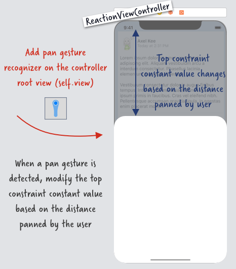
Next we will add a Pan Gesture Recognizer on the view controller's root view, to detect user's drag/pan movement and move the card view accordingly. You might be wondering "shouldn't the pan gesture recognizer be on the card view instead of the whole view controller's view?", if you try to drag on the area outside of card view on Facebook / Slack, the card view will move as well!
xxxxxxxxxx// ReactionViewController.swiftclass ReactionViewController: UIViewController { // ... override func viewDidLoad(){ super.viewDidLoad() // ... // add pan gesture recognizer to the view controller's view (the whole screen) let viewPan = UIPanGestureRecognizer(target: self, action: #selector(viewPanned(_:))) // by default iOS will delay the touch before recording the drag/pan information // we want the drag gesture to be recorded down immediately, hence setting no delay viewPan.delaysTouchesBegan = false viewPan.delaysTouchesEnded = false self.view.addGestureRecognizer(viewPan) } // this function will be called when user pan/drag the view @IBAction func viewPanned(_ panRecognizer: UIPanGestureRecognizer) { // how much distance has user dragged the card view // positive number means user dragged downward // negative number means user dragged upward let translation = panRecognizer.translation(in: self.view) print("user has dragged \(translation.y) point vertically") }}
Build and run the app now, and drag the card view, you will the console log as follows :
When user drag upward, the translation.y will be negative value, and when user drag downward, the translation.y will be positive value. We will add this translation.y value to the top constraint value of the card view to move it.
There's three state of panGestureRecognizer, .began, .changed and .end .
.began is right before we drag the view with finger (we just place finger on screen, haven't move yet).
.changed is when we are moving our finger on screen (dragging).
.end is when we finish drag and lift our finger away from screen.
In .began state, we store the current card view's top constraint constant value into the variable cardPanStartingTopConstraint :
xxxxxxxxxxcardPanStartingTopConstaint = cardViewTopConstraint.constantThis is so that in the .changed state, we can update the card view top constraint value by adding the distance dragged (translation.y) :
xxxxxxxxxxself.cardViewTopConstraint.constant = self.cardPanStartingTopConstaint + translation.yAnd we don't want the user to be able to drag the card view lesser than 30pt (< 30 pt) away from Safe Area top :
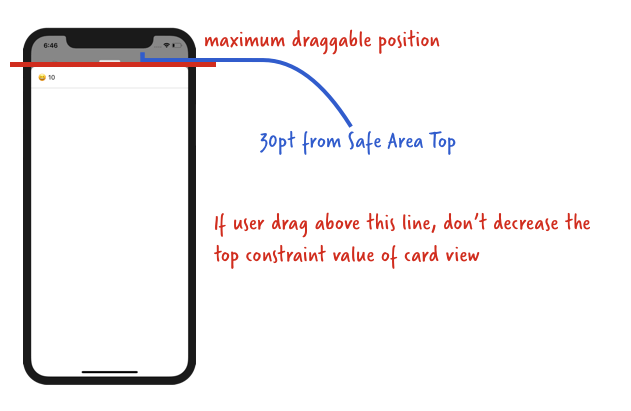
Converting these into code :
xxxxxxxxxx// if the current drag distance + starting drag position is larger than 30 ptif self.cardPanStartingTopConstaint + translation.y > 30.0 { // then only move the card self.cardViewTopConstraint.constant = self.cardPanStartingTopConstaint + translation.y}
And putting them together into the viewPanned() function :
xxxxxxxxxx@IBAction func viewPanned(_ panRecognizer: UIPanGestureRecognizer) { // how much has user dragged let translation = panRecognizer.translation(in: self.view) switch panRecognizer.state { case .began: cardPanStartingTopConstraint = cardViewTopConstraint.constant case .changed : if self.cardPanStartingTopConstraint + translation.y > 30.0 { self.cardViewTopConstraint.constant = self.cardPanStartingTopConstraint + translation.y } case .ended : print("drag ended") // we will do other stuff here later on default: break }}
Now build and run the project, we should be able to drag the card view around now :
Looking good! But somehow something feels off, in the Facebook / Slack app, when we release the card view, it will snap to a certain position. Our current implementation doesn't have the "snap to" effect hence it feels a bit sloppy, we are going to add the "snap-to effect" next.
Adding a snap-to effect
As the card has two state, .normal and .expanded , we want the card to snap to different state (and size) depending on the height of the card when user stop dragging.
Here's a diagram of what card state to snap to when user release the drag :
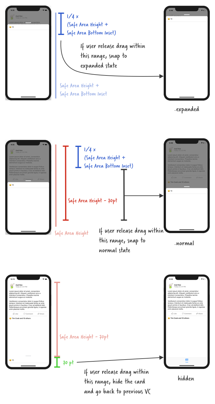
When user release drag, the pan recognizer state is .ended . We can translate the above diagram into code like this :
xxxxxxxxxx@IBAction func viewPanned(_ panRecognizer: UIPanGestureRecognizer) { // how much has user dragged let translation = panRecognizer.translation(in: self.view) switch panRecognizer.state { case .began: cardPanStartingTopConstraint = cardViewTopConstraint.constant case .changed : if self.cardPanStartingTopConstraint + translation.y > 30.0 { self.cardViewTopConstraint.constant = self.cardPanStartingTopConstraint + translation.y } case .ended : if let safeAreaHeight = UIApplication.shared.keyWindow?.safeAreaLayoutGuide.layoutFrame.size.height, let bottomPadding = UIApplication.shared.keyWindow?.safeAreaInsets.bottom { if self.cardViewTopConstraint.constant < (safeAreaHeight + bottomPadding) * 0.25 { // show the card at expanded state // we will modify showCard() function later } else if self.cardViewTopConstraint.constant < (safeAreaHeight) - 70 { // show the card at normal state showCard() } else { // hide the card and dismiss current view controller hideCardAndGoBack() } } default: break }}
Build and run the app, you should see that the card view will snap to "normal" state position or hide underneath when you release the drag, we're almost there! 🙌
Currently, our showCard() function will only animate the card to the middle position (.normal state). We can create another function to animate the card to the top position (.expanded state), but it would be a waste to not reuse the showCard() function as most of the animation code are same except for the card view top constraint value.
Let's edit the showCard() function, update the function name to accept a parameter atState: CardState, so that it will animate to the specified card state (.normal or .expanded).
xxxxxxxxxx// default to show card at normal state, if showCard() is called without parameterprivate func showCard(atState: CardViewState = .normal) { // ensure there's no pending layout changes before animation runs self.view.layoutIfNeeded() // set the new top constraint value for card view // card view won't move up just yet, we need to call layoutIfNeeded() // to tell the app to refresh the frame/position of card view if let safeAreaHeight = UIApplication.shared.keyWindow?.safeAreaLayoutGuide.layoutFrame.size.height, let bottomPadding = UIApplication.shared.keyWindow?.safeAreaInsets.bottom { if atState == .expanded { // if state is expanded, top constraint is 30pt away from safe area top cardViewTopConstraint.constant = 30.0 } else { cardViewTopConstraint.constant = (safeAreaHeight + bottomPadding) / 2.0 } cardPanStartingTopConstraint = cardViewTopConstraint.constant } // move card up from bottom // create a new property animator let showCard = UIViewPropertyAnimator(duration: 0.25, curve: .easeIn, animations: { self.view.layoutIfNeeded() }) // show dimmer view // this will animate the dimmerView alpha together with the card move up animation showCard.addAnimations { self.dimmerView.alpha = 0.7 } // run the animation showCard.startAnimation()}
Then we can now plug the modified showCard(atState: .expanded) to the viewPanned() function to snap to expanded state :
xxxxxxxxxx@IBAction func viewPanned(_ panRecognizer: UIPanGestureRecognizer) { // how much has user dragged let translation = panRecognizer.translation(in: self.view) switch panRecognizer.state { case .began: cardPanStartingTopConstraint = cardViewTopConstraint.constant case .changed : if self.cardPanStartingTopConstraint + translation.y > 30.0 { self.cardViewTopConstraint.constant = self.cardPanStartingTopConstraint + translation.y } case .ended : if let safeAreaHeight = UIApplication.shared.keyWindow?.safeAreaLayoutGuide.layoutFrame.size.height, let bottomPadding = UIApplication.shared.keyWindow?.safeAreaInsets.bottom { if self.cardViewTopConstraint.constant < (safeAreaHeight + bottomPadding) * 0.25 { // show the card at expanded state showCard(atState: .expanded) } else if self.cardViewTopConstraint.constant < (safeAreaHeight) - 70 { // show the card at normal state showCard(atState: .normal) } else { // hide the card and dismiss current view controller hideCardAndGoBack() } } default: break }}
Build and run the app, now when you release the drag near the top, the card will animate to the expanded state! 🙌
Wait, there's one more thing! There's still one functionality to be implemented for the dragging. 😂 If you have noticed, when you open the Reaction List card view from Facebook app, you can dismiss it by dragging it down to bottom or swipe it down really fast.
So far we only implemented the dismiss (hideCardAndGoBack() ) when user drag the card view to the bottom, now we are going to implement the dismiss when user swipe it down really fast.
Swipe down to dismiss card view
To detect if user is dragging / swiping down really fast, we can use the velocity property from the pan gesture recognizer to check the speed of dragging :
xxxxxxxxxxpanRecognizer.velocity(in: self.view)
Similar to the translation property, if user drag upwards, the velocity will be in negative value, and if user drag downwards, the velocity will be in positive value. The faster the user drag it, the bigger the velocity is.
You can use a print statement to record down the velocity of drag / swipe speed. I have experimented a bit and found the threshold for the speed of swiping down quickly is around 1500.
Putting it in code, the viewPanned function's .ended state :
xxxxxxxxxx@IBAction func viewPanned(_ panRecognizer: UIPanGestureRecognizer) { // how much has user dragged let translation = panRecognizer.translation(in: self.view) // how fast the user drag let velocity = panRecognizer.velocity(in: self.view) switch panRecognizer.state { case .began: cardPanStartingTopConstraint = cardViewTopConstraint.constant case .changed : if self.cardPanStartingTopConstraint + translation.y > 30.0 { self.cardViewTopConstraint.constant = self.cardPanStartingTopConstraint + translation.y } case .ended : // if user drag down with a very fast speed (ie. swipe) if velocity.y > 1500.0 { // hide the card and dismiss current view controller hideCardAndGoBack() return } if let safeAreaHeight = UIApplication.shared.keyWindow?.safeAreaLayoutGuide.layoutFrame.size.height, let bottomPadding = UIApplication.shared.keyWindow?.safeAreaInsets.bottom { if self.cardViewTopConstraint.constant < (safeAreaHeight + bottomPadding) * 0.25 { // show the card at expanded state showCard(atState: .expanded) } else if self.cardViewTopConstraint.constant < (safeAreaHeight) - 70 { // show the card at normal state showCard() } else { // hide the card and dismiss current view controller hideCardAndGoBack() } } default: break }}
And now we can swipe down quickly to dismiss the card view :
Looking good! You could call this a day if you wanted to, but there's still a thing (okay I promise this is the last one) to nitpick of. When we drag on the card view, the alpha of the dimmer view should change depending on how far have we dragged the card view. The background should be darker when we drag upwards, and lighter when we drag downwards.
Dimmer view alpha manipulation
Here's an example on Facebook card view, notice the background gets darker when we drag upward, but it doesn't get any more darker after the card reached the normal state distance :

Notice that the background doesn't get darker if we drag the card upwards from its normal state to expanded state. The alpha of the dimmer view only change when the card is between normal state and hidden (bottom of visible area).
Here's an explanation on how the alpha of dimmer view changes :
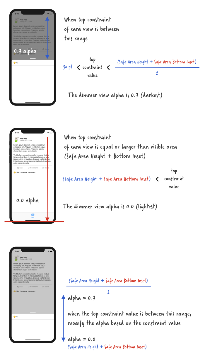
We can write a function that accepts a parameter, which is the current top constraint value of the card view, and use this parameter to calculate and return the alpha of the dimmer view.
Let's call this function dimAlphaWithCardTopConstraint(value: CGFloat) :
xxxxxxxxxx// ReactionViewController.swiftprivate func dimAlphaWithCardTopConstraint(value: CGFloat) -> CGFloat { let fullDimAlpha : CGFloat = 0.7 // ensure safe area height and safe area bottom padding is not nil guard let safeAreaHeight = UIApplication.shared.keyWindow?.safeAreaLayoutGuide.layoutFrame.size.height, let bottomPadding = UIApplication.shared.keyWindow?.safeAreaInsets.bottom else { return fullDimAlpha } // when card view top constraint value is equal to this, // the dimmer view alpha is dimmest (0.7) let fullDimPosition = (safeAreaHeight + bottomPadding) / 2.0 // when card view top constraint value is equal to this, // the dimmer view alpha is lightest (0.0) let noDimPosition = safeAreaHeight + bottomPadding // if card view top constraint is lesser than fullDimPosition // it is dimmest if value < fullDimPosition { return fullDimAlpha } // if card view top constraint is more than noDimPosition // it is dimmest if value > noDimPosition { return 0.0 } // else return an alpha value in between 0.0 and 0.7 based on the top constraint value return fullDimAlpha * 1 - ((value - fullDimPosition) / fullDimPosition)}
Then we can use this function in the viewPanned() function's .changed state like this :
xxxxxxxxxx@IBAction func viewPanned(_ panRecognizer: UIPanGestureRecognizer) { let velocity = panRecognizer.velocity(in: self.view) let translation = panRecognizer.translation(in: self.view) switch panRecognizer.state { case .began: cardPanStartingTopConstraint = cardViewTopConstraint.constant case .changed: if self.cardPanStartingTopConstraint + translation.y > 30.0 { self.cardViewTopConstraint.constant = self.cardPanStartingTopConstraint + translation.y } // change the dimmer view alpha based on how much user has dragged dimmerView.alpha = dimAlphaWithCardTopConstraint(value: self.cardViewTopConstraint.constant) case .ended: if velocity.y > 1500.0 { hideCardAndGoBack() return } if let safeAreaHeight = UIApplication.shared.keyWindow?.safeAreaLayoutGuide.layoutFrame.size.height, let bottomPadding = UIApplication.shared.keyWindow?.safeAreaInsets.bottom { if self.cardViewTopConstraint.constant < (safeAreaHeight + bottomPadding) * 0.25 { showCard(atState: .expanded) } else if self.cardViewTopConstraint.constant < (safeAreaHeight) - 70 { showCard(atState: .normal) } else { hideCardAndGoBack() } } default: break }}
Build and run the app, drag the card view and see the dimmer alpha changes! 🤘
Congratulations! You have managed to implement a draggable card modal view without using any library 😆🙌. (Remember, Cocoa developer, not Cocoapod developer, jk 😂)
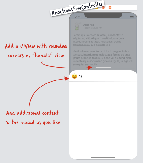
The next step is optional but I think it would make a better experience of the user by placing a "handle" view as an indicator that the card view is draggable.
Adding handle view
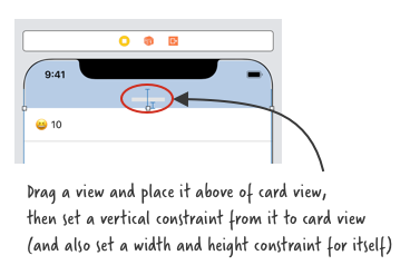
Adding a handle view is quite straightforward. Open storyboard, drag a view and place it above the card view, set a gray background color for it, then set a width / height constraint for itself, horizontal to superview constraint, and a vertical spacing constraint to the card view.
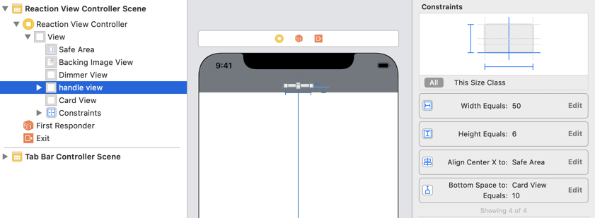
Next, we are going to round its corner. To do this, create an IBOutlet (I named it as handleView) for the handle view, and round it in viewDidLoad.
xxxxxxxxxx// round the handle viewhandleView.clipsToBounds = truehandleView.layer.cornerRadius = 3.0
I have added UILabel and another separator view into the card view, you can add any additional content you want inside the card view.
The end result looks like this :