Replicating Spotify's Now Playing UI using Auto Layout
Table of contents
- Deconstructing Spotify's Now Playing UI
- Album Art Collection View
- Album Art Collection View Cell
- Play button
- Playback buttons and stack view
- Progress Slider
- Current result
- Set Data source and Delegate of Collection View
- Add Insets to Collection View
- Add Zoom Effect to the Collection View Cell when scrolled
- Add Fade effect to the Collection View Cell when scrolled
- Add Snap-to Nearest effect when user stops scrolling
Deconstructing Spotify's Now Playing UI
We will breakdown and analyze the Now Playing screen of Spotify app, and try to replicate it using Auto Layout.
The playback button icons used in this post are from Font Awesome, you can use fa2png.io to generate png images from the font awesome icons.
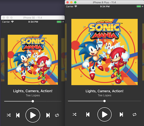
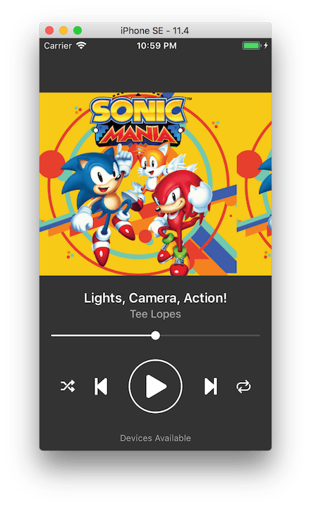
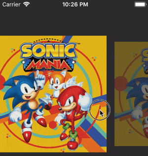
Here's the Now Playing screen of Spotify viewed in iPhone 8 screen size:

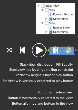
The scrollable album art is a collection view, song name and artist name are labels, there's five button (shuffle, previous, play/pause, next, repeat), the song progress bar is a slider. The left two and right two buttons are grouped in stack views, this will be explained more later.
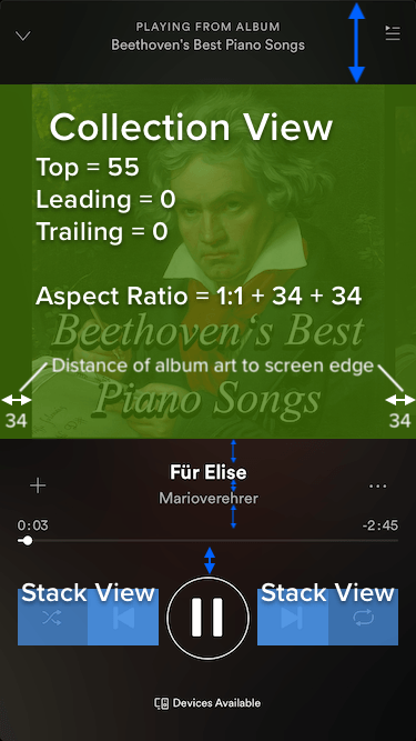
The vertical distance of each UI elements are shown using the blue arrow. Feel free to tweak the value of the vertical constraint until it feels right for you.
Album Art Collection View
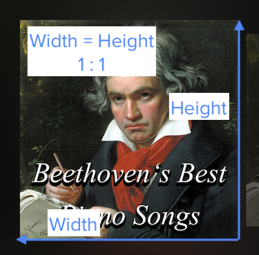
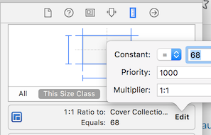
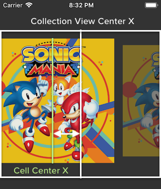
Let's say each album art is a collection view cell itself, each cell is a square , meaning its width is equal to height, this means a ratio of 1:1 .
To make it simple, assume the collection view containing the cell has the same height as the cell itself, with same width but with added spacing on the left (34 pt) and right (34 pt). This means the collection view has an aspect ratio of 1:1 + 34 +34 = 1:1 + 68.
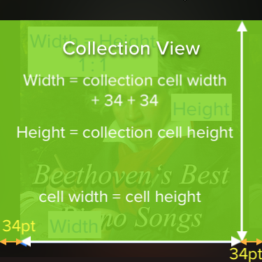
xxxxxxxxxx1 * width = 1 * height + 34 +34width = height + 68height = width - 68
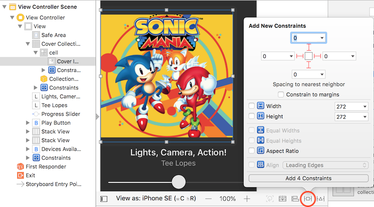
The collection view has a top constraint to the top edge of safe area, leading constraint with value 0, trailing constraint with value 0. The leading and trailing constraint means that the collection view's width is equal to the screen width.
Since there are distances from the album art to the screen edge (left and right), and the album art is a square, the height of the collection view will be 68 pt lesser than its width.
We can set a ratio constraint on the collection view like this :
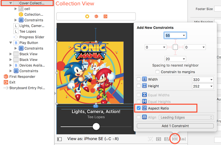
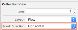
In the attribute inspector, set the scrolling direction of the collection view to horizontal.
Album Art Collection View Cell
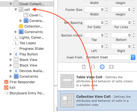
After creating the collection view, drag a collection view cell into the collection view if there isn't one already :
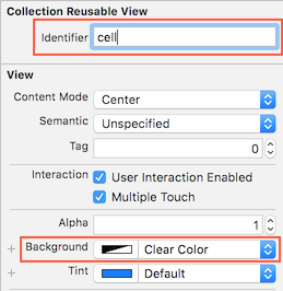
Set the collection view cell's background color to "Clear color" so it will be transparent. This is needed when we do the fading effect of the album art image in the next part. We will also set a reuse identifier for the cell so we can reuse it in code in the next part.
After that, drag an image view into the cell and add constraints to make the image has the same size as the cell. Create a top, leading, trailing and bottom constraints with value 0 for the image view.
Next, set the imageview's image to your favorite album art picture! 😆
Play button
Say you are using the play button from Font Awesome like this :

To make it simple, we set a fixed width (74pt) and height (74pt) for the Play button and center it horizontally to the parent view.
To add a surrounding circle to the play button, we can use the cornerRadius and borderWidth property of the button's layer.
xxxxxxxxxx// the circle around the play buttonplayButton.layer.cornerRadius = playButton.frame.size.height / 2.0playButton.layer.borderWidth = 2.0playButton.layer.borderColor = UIColor.white.cgColor
Hmmm, now the play button image seems too big and too close to the surrounding circle :

We can adjust the Image Insets of the button in Size inspector tab to add padding to the image :
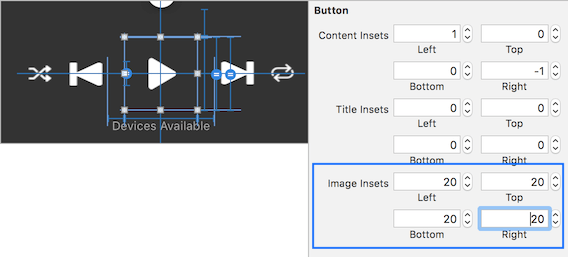
The image insets means the spacing from the image to the button edge. With the above values, we will set 20 pt padding on top, left, bottom and right for the image inside button.
After adding insets, the play button looks better now with padding :

Playback buttons and stack view
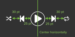
The play button is located in the center (using the align horizontal center constraint), and there's other buttons beside it. At first glance, using fixed leading / trailing constraint between each button seems to do the job :
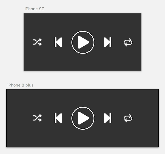
These constraints looks fine on an iPhone SE screen size, but when viewed on iPhone 8 plus, the left and right edge of the screen feels empty as it have too much blank space.
To reduce the blank space, we will have to distribute the button evenly, meaning they occupy a certain proportion of the width of the screen size. As the screen width increase, they should occupy more width so that there wouldn't be a chunk of blank space.
To distribute button evenly, we can use a stack view and set its Distribution property to Fill Equally. Then we place placeholder views inside the stackview and each of the placeholder view has the same width. Next we place the button inside the placeholder view, and horizontally center the button to the placeholder view.
Repeat this process for the left part (shuffle and previous buttons). Now you should have an evenly distributed buttons. But you might find the image on the button stretches, this is because the content mode of image inside a button is "Scale to Fill" by default. To resolve the stretching issue, we can set the content mode to "Aspect Fit" using code :
xxxxxxxxxx// make the image on these button become aspect fit so it won't stretchshuffleButton.imageView?.contentMode = .scaleAspectFitpreviousButton.imageView?.contentMode = .scaleAspectFitforwardButton.imageView?.contentMode = .scaleAspectFitrepeatButton.imageView?.contentMode = .scaleAspectFit
This is how the playback buttons looks like in iPhone SE and iPhone 8 plus using stack view:
Progress Slider
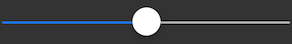
A default slider looks like this:
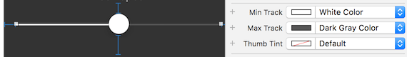
You can customize the left bar color and right bar color with the Min Track and Max track color property.
As the default circle size is too large for the song progress slider, we can replace it with a smaller circle (the circle is called as "Thumb"). You will need to prepare an image containing a smaller circle for this.
xxxxxxxxxx// set image for the button of the slider, when not selected, its smallprogressSlider.setThumbImage(UIImage(named: "sliderThumb"), for: .normal)
If you have noticed, when you are selecting the slider in Spotify, the thumb become larger and has another layer of half-transparent circle around it.

The easiest way to replicate this is to prepare an image for it. And set a different thumb image for the selected state.
xxxxxxxxxx// when selected, use a larger imageprogressSlider.setThumbImage(UIImage(named: "sliderThumbSelected"), for: .highlighted)
Current result
It kinda looks good now! Just that the collection view cell doesn't have spacing and doesn't have the zooming / fade out effect when scrolled. We will add these effect into the collection view next.
Set Data source and Delegate of Collection View
Create a custom collection view cell type, let's name it as "CoverCollectionViewCell". Set the class of the cell in Storyboard to "CoverCollectionViewCell". Then connect the album art image view in the cell in Storyboard to create an UIImageView outlet.
xxxxxxxxxx// CoverCollectionViewCell.swiftclass CoverCollectionViewCell: UICollectionViewCell { @IBOutlet weak var coverImageView: UIImageView!}
Link the collection view into the view controller, and set data source and delegate (UICollectionViewDelegateFlowLayout).
xxxxxxxxxxclass ViewController: UIViewController { @IBOutlet weak var coverCollectionView: UICollectionView! // in IB, click on the attribute inspector of the collection view cell, and find the 'Reuse Identifier' let cellReuseIdentifier = "cell" override func viewDidLoad() { coverCollectionView.dataSource = self coverCollectionView.delegate = self // hide the scroll indicator coverCollectionView.showsHorizontalScrollIndicator = false }}extension ViewController : UICollectionViewDataSource { // hardcode to show 10 cells, you can use array for this if you want func collectionView(_ collectionView: UICollectionView, numberOfItemsInSection section: Int) -> Int { return 10 } func collectionView(_ collectionView: UICollectionView, cellForItemAt indexPath: IndexPath) -> UICollectionViewCell { let cell = collectionView.dequeueReusableCell(withReuseIdentifier: cellReuseIdentifier, for: indexPath) as! CoverCollectionViewCell return cell }}// Cell height is equal to the collection view's height// Cell width = cell height = collection view's heightextension ViewController : UICollectionViewDelegateFlowLayout { func collectionView(_ collectionView: UICollectionView, layout collectionViewLayout: UICollectionViewLayout, sizeForItemAt indexPath: IndexPath) -> CGSize { return CGSize(width: collectionView.frame.size.height, height: collectionView.frame.size.height) }}
Now we have a somewhat dynamic collection view, and the cell size are dynamic based on the collection view size / screen size!
Add Insets to Collection View
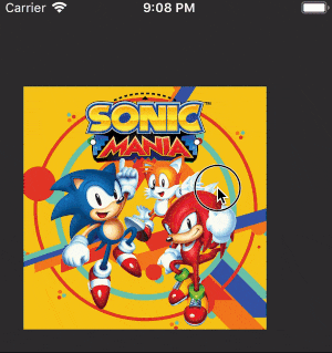
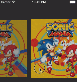
Our collection view currently looks like this :
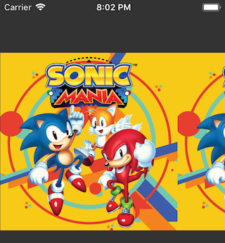
The first collection view cell is not center aligned as it sticks to the left edge of the collection view. Same goes to the last cell as it sticks to the right edge. We will add some padding to the left and right of the collection view, so that when user scroll to the first / last cells, there will be some space on the left / right edge.
xxxxxxxxxxoverride func viewDidLoad() { //.... coverCollectionView.dataSource = self coverCollectionView.delegate = self coverCollectionView.showsHorizontalScrollIndicator = false // padding space = collection view width - cell width let leftPadding = (coverCollectionView.frame.size.width - coverCollectionView.frame.size.height) / 2.0 let rightPadding = leftPadding coverCollectionView.contentInset = UIEdgeInsets(top: 0, left: leftPadding, bottom: 0, right: rightPadding)}Remember the aspect ratio we set for the collection view in previous part? The cell height is equal to the collection view's height, cell width is equal to cell height, hence cell width is equal to the collection's view height. If you are confused about how the value of padding is calculated, here's some explanation :
xxxxxxxxxxleft padding = right paddingcell height = collection view heightcell width = cell heightcell width = collection view heightleft padding + right padding = collection view width - cell widthleft padding + right padding = collection view width - cell heightleft padding + right padding = collection view width - collection view heightleft padding = (collection view width - collection view height) / 2right padding = (collection view width - collection view height) / 2
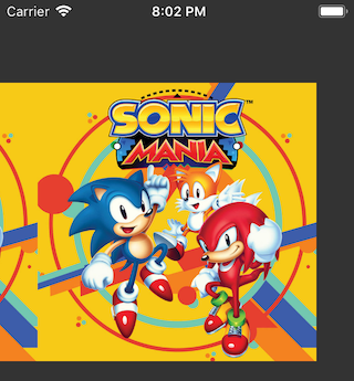
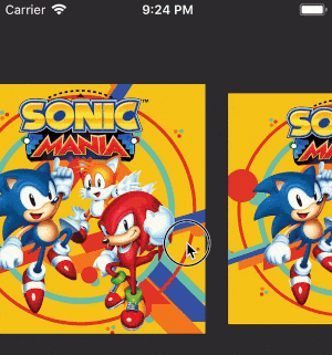
After setting the left padding and right padding insets, when scrolling to the first / last cell, it looks good now :
Add Zoom Effect to the Collection View Cell when scrolled
The fun part! When scrolling the collection view, as the middle cell is being scrolled to the side, its size become smaller, and the neighbouring cell approaching middle will become larger.
One way to think about this is that the size of the cell become smaller when it become further from the center of the collection view. When the cell is in the center, it has its original size, meaning the scale is 1x. When the cell move to left / right, we make it smaller by multiplying its size with a smaller scale (eg: 0.9x). The value of scale is determined by the distance from the center of the cell to the center of the collection view.
xxxxxxxxxx// abs means absolute value, eg: abs(-5) = 5, abs(5) = 5distance = abs(cell center X - collection view center X)// 1.0 is the max scale, which is the value when the cell is in the exact centerscale = 1.0 - (distance / collection view center X)// maximum cell size is the value returned from sizeForItemAt: methodcell size = maximum cell size * scale
If we used the above formula, we will get the scaling effect but the scale can become zero or less than zero when the distance from cell center to collection view center is larger than the collection view center X position value!
To solve this problem, we will multiply value of (distance / collection view center x) with a number smaller than 1 so that it doesn't get too big, making scale too small.
Let's multiply it with 0.105 (you can use any other number smaller than 1 if you like), we will modify the above calculation to this :
xxxxxxxxxx// abs means absolute value, eg: abs(-5) = 5, abs(5) = 5distance = abs(cell center X - collection view center X)// 1.0 is the max scale, which is the value when the cell is in the exact center// multiply the (distance / collection view center X) with 0.105 to make it smallerscale = 1.0 - ((distance / collection view center X) * 0.105)// maximum cell size is the value returned from sizeForItemAt: methodcell size = maximum cell size * scale
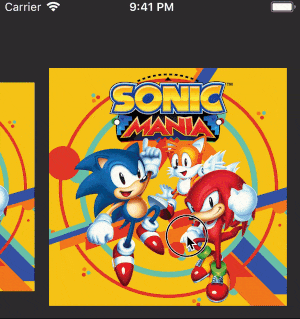
It looks better now:
If you pay attention to the Spotify album art collection view, the album art doesn't immediately get shrinked when it is moving away from the center. There is a minimum scroll distance required before the album art get shrinked.
Notice that within a certain scrolling distance, the size of the album art doesn't change :
We can implement the minimum scroll distance by adding a tolerance value and a if-check like this:
xxxxxxxxxx// abs means absolute value, eg: abs(-5) = 5, abs(5) = 5distance = abs(cell center X - collection view center X)// 1.0 is the max scale, which is the value when the cell is in the exact centertolerance = 0.02scale = 1.0 + tolerance - ((distance / collection view center X) * 0.105)if(scale > 1.0){scale = 1.0}// maximum cell size is the value returned from sizeForItemAt: methodcell size = maximum cell size * scale
What this do is that it add 0.02 to the scale value, for example, let say on a certain scrolling distance, the scale is supposed to be 0.98, then a 0.02 is added to it, making the scale 1.0, thus on that distance, the album art still haven't shrink. When the album art is on the exact middle, the scale value would be 1.02, we then update it to 1.0 by using the if check so that it doesn't grow larger than 1.0.
Now it looks good, we can apply the calculation into code like this :
xxxxxxxxxxextension ViewController : UIScrollViewDelegate { // perform scaling whenever the collection view is being scrolled func scrollViewDidScroll(_ scrollView: UIScrollView) { // center X of collection View let centerX = self.coverCollectionView.center.x // only perform the scaling on cells that are visible on screen for cell in self.coverCollectionView.visibleCells { // coordinate of the cell in the viewcontroller's root view coordinate space let basePosition = cell.convert(CGPoint.zero, to: self.view) let cellCenterX = basePosition.x + self.coverCollectionView.frame.size.height / 2.0 let distance = fabs(cellCenterX - centerX) let tolerance : CGFloat = 0.02 var scale = 1.00 + tolerance - (( distance / centerX ) * 0.105) if(scale > 1.0){ scale = 1.0 } // set minimum scale so the previous and next album art will have the same size // I got this value from trial and error // I have no idea why the previous and next album art will not be same size when this is not set 😅 if(scale < 0.860091){ scale = 0.860091 } // Transform the cell size based on the scale cell.transform = CGAffineTransform(scaleX: scale, y: scale) } }}
Since collection view is a subclass of scrollview, when you set collectionView.delegate = self in the viewDidLoad, you can use the scroll view delegate method on the collection view in the view controller.
Add Fade effect to the Collection View Cell when scrolled
Similar to the zoom effect, we want to dim the album art when it is being scrolled to the side. Since we already have the scale value, we can use it to indicate the alpha of the album art image view. (Alpha 1.0 is fully opaque, alpha 0.0 is fully invisible)
We can add the code to change the alpha of the image view after the cell.transform = CGAffineTransform line.
xxxxxxxxxxextension ViewController : UIScrollViewDelegate { func scrollViewDidScroll(_ scrollView: UIScrollView) { let centerX = self.coverCollectionView.center.x for cell in self.coverCollectionView.visibleCells { //.... cell.transform = CGAffineTransform(scaleX: scale, y: scale) // change the alpha of the image view let coverCell = cell as! CoverCollectionViewCell coverCell.coverImageView.alpha = scale } }}
Since the value of scale is between 0.86 and 1.0 , using this as alpha value doesn't show much difference in transparency. We want the alpha value to between 0.25 and 1.0 . To transform the value range from 0.86 - 1.0 to 0.25 - 1.0, we can write a function to transform the range using some mathematical formula.
xxxxxxxxxxextension ViewController : UIScrollViewDelegate { func scrollViewDidScroll(_ scrollView: UIScrollView) { let centerX = self.coverCollectionView.center.x for cell in self.coverCollectionView.visibleCells { //.... cell.transform = CGAffineTransform(scaleX: scale, y: scale) // change the alpha of the image view let coverCell = cell as! CoverCollectionViewCell coverCell.coverImageView.alpha = changeSizeScaleToAlphaScale(scale) } } // map the scale of cell size to alpha of image view using formula below // https://stackoverflow.com/questions/5294955/how-to-scale-down-a-range-of-numbers-with-a-known-min-and-max-value func changeSizeScaleToAlphaScale(_ x : CGFloat) -> CGFloat { let minScale : CGFloat = 0.86 let maxScale : CGFloat = 1.0 let minAlpha : CGFloat = 0.25 let maxAlpha : CGFloat = 1.0 return ((maxAlpha - minAlpha) * (x - minScale)) / (maxScale - minScale) + minAlpha }}The album art collection view is looking good now! When an album art is moving towards the edge of screen, it will get dimmed.
The only thing left now is a "snap-to nearest" effect, meaning if user stop scrolling the collection view, it should snap to the nearest album art and putting it in the middle.
Add Snap-to Nearest effect when user stops scrolling
The logic of snap-to nearest is that when user stops scrolling, the collection view should auto scroll to the current largest sized cell, and put the cell in the middle. The method that will be called when user stop scrolling a scrollview is scrollViewDidEndDragging.
To find the largest sized cell, we will loop through all the current visible cells in the collection view, record down the largest width value and the index of the cell with the largest width value. Then we will call collectionView.scrollToItem(at: ) to instruct the collection view to scroll to that cell.
xxxxxxxxxxextension ViewController : UIScrollViewDelegate { func scrollViewDidScroll(_ scrollView: UIScrollView) { //.... } // for custom snap-to paging, when user stop scrolling func scrollViewDidEndDragging(_ scrollView: UIScrollView, willDecelerate decelerate: Bool) { return var indexOfCellWithLargestWidth = 0 var largestWidth : CGFloat = 1 for cell in self.coverCollectionView.visibleCells { if cell.frame.size.width > largestWidth { largestWidth = cell.frame.size.width if let indexPath = self.coverCollectionView.indexPath(for: cell) { indexOfCellWithLargestWidth = indexPath.item } } } coverCollectionView.scrollToItem(at: IndexPath(item: indexOfCellWithLargestWidth, section: 0), at: .centeredHorizontally, animated: true) }}
After adding the snap-to nearest effect, it will look like this when user releases finger during scroll:
Congratulation if you have made it this far, you have successfully replicated Spotify's Now Playing UI screen! 🎉