Replicating Twitter Profile UI using Auto Layout
Table of contents
- Deconstructing components of the profile screen
- Constructing Tableview with list of tweets
- Constructing header container view (containing cover image)
- Constructing Avatar (Profile picture)
- Finishing Touch
- Adjusting for iPhone X / XS / XR (Added in 13 November 2018)
Note : This guide was originally written for device without rounded corner like iPhone SE / iPhone 8 / iPhone 8 Plus.
Please use iPhone SE / 8 / 8 Plus simulator for following steps below. There will be a section at the end to adjust the completed layout for iPhone X / XS / XR. Around ~10 lines of codes.
Deconstructing components of the profile screen
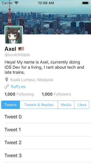
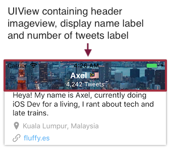
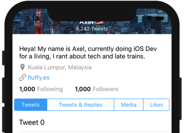
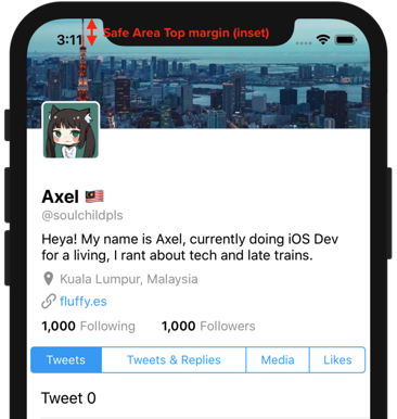
When you navigate to the profile page of Twitter app, you will see this screen:
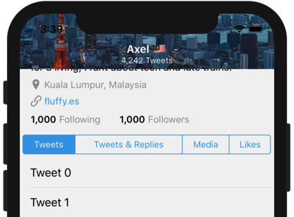
If you scroll down, you will notice that the header / cover image height shrinks and stay fixed at a certain height.
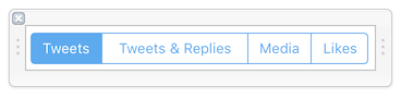
And if you continue scrolling, the segmented control ('Tweets', 'Tweets & Replies', 'Media', 'Likes') will be fixed on top, located just below the cover / header image, like this :
With this observation, we can do some guesswork on what components is used for this layout. The most obvious one is that there is a tableview which contain list of tweets, then the segmented control is the tableview's section header view as it will stay fixed on top while scrolling. (Tableview's section header view will always stay on top of a section, for example, you can open up the Phone app and go to 'Contacts' tab, and as you scroll down, you will see that the initials 'A' / 'B' / 'C' stick on the top.)
And on top of the segmented control, there is some labels containing username, display name, descriptions, location, website and number of followers / following, these labels reside on the table view's header view (a custom view above tableview cells and section headers).
On top of the tableview, there is an image view containing the header image. It is actually an image inside a blank UIView, which we will discuss more about it later, the gist is that a blank UIView is used to contain the header image view and also the small labels of display name and number of tweets (that will appear when user scrolled down far enough).
And there's also the user avatar image placed in front of the tableview / header image. As the avatar image has a white border around it, you can either use self.avatarImageView.layer.borderColor = UIColor.white.cgColor or embed the avatar imageview inside a blank UIView with white background. I chose the approach of embedding the avatar imageview inside an UIView as it will be easier to add more elements inside the UIView in the future.
The combined components in the profile screen looks like this:
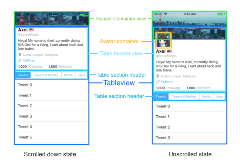
Notice that the tableview in both scrolled down state and unscrolled state have the same height.
In the unscrolled state, the header container view has a taller height and overlaps the table view. The avatar container is on top of both the tableview and header container view. In 3D, the layers look like this :
The indigo highlighted part is the tableview. Notice that the header container view is in front of the tableview and blocking some part of the tableview, and the avatar container view is in front of the header container view.
Constructing Tableview with list of tweets
First create an empty iOS single view project, then drag a table view into the view controller in the storyboard. Add the top / leading / trailing / bottom constraint like this :
Connect the tableview outlet to the view controller, and set up datasource / delegate.
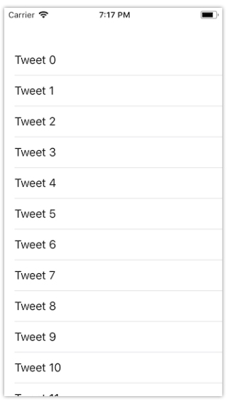
class ViewController: UIViewController { @IBOutlet weak var tweetTableView: UITableView! override func viewDidLoad() { super.viewDidLoad() // Do any additional setup after loading the view, typically from a nib. // This will register "UITableViewCell" string as the reuse identifier self.tweetTableView.register(UITableViewCell.self, forCellReuseIdentifier: String(describing: UITableViewCell.self) ) self.tweetTableView.dataSource = self self.tweetTableView.delegate = self }}extension ViewController : UITableViewDataSource { func numberOfSections(in tableView: UITableView) -> Int { return 1 } // set to a number you like, but large enough that we have space to scroll down. func tableView(_ tableView: UITableView, numberOfRowsInSection section: Int) -> Int { return 30 } func tableView(_ tableView: UITableView, cellForRowAt indexPath: IndexPath) -> UITableViewCell { let cell = tableView.dequeueReusableCell(withIdentifier: String(describing: UITableViewCell.self), for: indexPath) cell.textLabel?.text = "Tweet \(indexPath.row)" return cell }}extension ViewController : UITableViewDelegate { // MARK: - Scrolling // This will be used a lot later on func scrollViewDidScroll(_ scrollView: UIScrollView) { }}
We now have a table view which show a some rows of tweet. Next, we will add the section header view ( the one with multiple tabs)
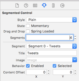
Create a new View file in your project, and save it as "SegmentHeaderView".
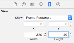
Then change its size to "Freeform" and set it as width 320 and height 40. (320 to match the smallest iPhone screen width, I feel it is easier to design for smaller screen then scale up later)
Now we have a small cozy View, drag a segmented control into it, and add some constraints so that it have some padding distance to the parent view.
Then add more segments to it and change the segments title to "Tweets", "Tweets & replies", "Media", "Likes".
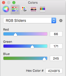
To make it match the color scheme of Twitter, in the attribute inspector tab, scroll down and change the Tint color. Change the tint color to this Hex : #42ABF5.
Then you will notice that the "Tweets & Replies" tab is truncated, this is because by default each tab have the same width in the segmented control.
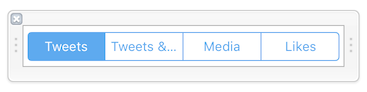
Since other tabs still have some free spaces, we can change the segmented control's Auto size mode to "Proportional to Content" :
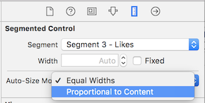
This will make each tabs width proportional to the text inside it, it looks good now!
Next, we will open the View Controller code and use the view we created earlier as the table view section header.
In the UITableViewDelegate extension, add in viewForHeaderInSection and heightForHeaderInSection methods:
extension ViewController : UITableViewDelegate { func tableView(_ tableView: UITableView, viewForHeaderInSection section: Int) -> UIView? { // instantiate UIView from .xib file let headerView = UINib(nibName: "SegmentHeaderView", bundle: nil).instantiate(withOwner: self, options: nil)[0] as! UIView return headerView } func tableView(_ tableView: UITableView, heightForHeaderInSection section: Int) -> CGFloat { return 40 } // MARK: - Scrolling // This will be used a lot later on func scrollViewDidScroll(_ scrollView: UIScrollView) { }}
These methods will instruct the tableview to use the SegmentHeaderView.xib as the table view section header view and set its height to 40pt.
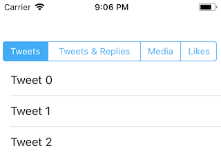
Build and run the app and you should see the tableview with the segmented control :
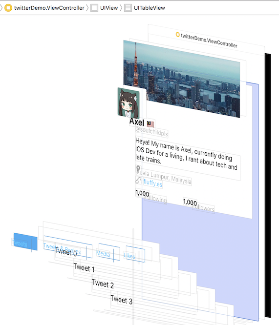
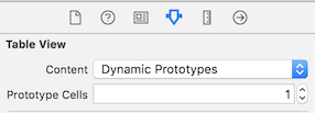
Next, we will add a header view to the tableview. To ensure the view we added is on top of cells (header, not footer), we will set the number of protoype cells of the table view to 1.
Then drag a view into the tableview like this:
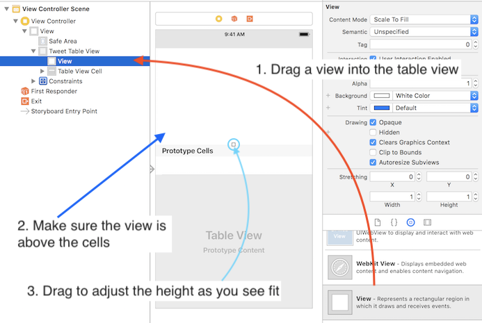
Now we can start adding labels into the table view. Feel free to style / position those labels as you like, and remember that you need to have sufficient vertical constraints which link the top of the table header view to the bottom of the header view, so that Auto Layout can calculate the height of the table header view at run time. (Refer section 'Placing UI Elements inside Content view' from Chapter 8 - Using Scrollview for content with dynamic size)
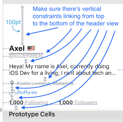
And also, set the top most constraint value to 100 pt (the top constraint from the topmost label to the top of the table header view). We will need this extra padding for the overlap of the header cover image later.
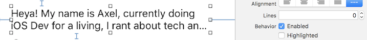
For the user description label, set its line number to 0 , so it can expand vertically as its text gets longer. Check the video located in videos/6/changeNumberOfLinesZero.mp4 , and remember to set the leading and trailing constraint for the label as well, so it doesn't grow horizontally (and off screen).
After adding labels, we would need to add some code to make the table header view become dynamic as the user description label can span multiple lines depending on its content. As table header view doesn't have .rowHeight = UITableViewAutomaticDimension which calculates and adjust the height of itself automatically, we would need to add some code for it.
class ViewController: UIViewController { // ... // after the view controller's root view has layout its subviews (eg: tableview) // and also called when the bounds of the root view is changed override func viewDidLayoutSubviews() { super.viewDidLayoutSubviews() self.adjustTableHeaderViewSize(tableView: self.tweetTableView) } func adjustTableHeaderViewSize(tableView: UITableView) { // originally the table header view is created using the frame size set in Storyboard // we will calculate the new size needed for the header view and ask the layout engine to update it guard let tableHeaderView = tableView.tableHeaderView else { return } // Make the header view of the table view to be dynamic height depending on the content inside (eg: the description label) // UILayoutFittingCompressedSize means use the smallest possible size that can fit the content inside the header view let headerSize = tableHeaderView.systemLayoutSizeFitting(UILayoutFittingCompressedSize) // this check is needed as changing the frame of header view will trigger a new layout cycle, causing viewDidLayoutSubviews to be called again // to prevent stuck in a loop, only change frame (ie. calling viewDidLayoutSubviews) when the height of header view havent set to minimum if(tableHeaderView.frame.size.height != headerSize.height){ // update the height for the table header view tableHeaderView.frame.size.height = headerSize.height // this line is needed to trigger the layout update tableView.tableHeaderView = tableHeaderView tableView.layoutIfNeeded() } }}
Now we have a tableview containing the info of the user and also list of tweet, looking good! Next we will construct the header container view for the cover photo.
Constructing header container view (containing cover image)
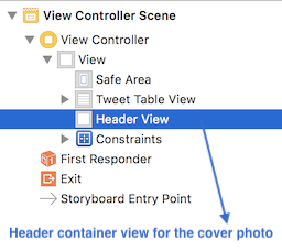
We will start by dragging a new view to the view controller and place it in front of the table view. Let's name this view as 'Header View' (header container view).
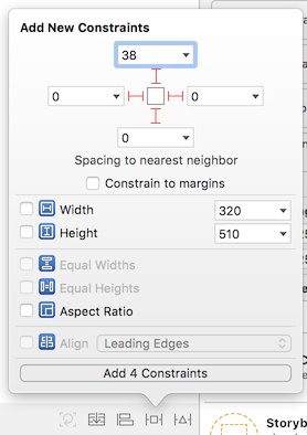
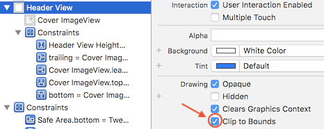
We then add top (0), leading (0), trailing (0) and height (120) constraints to it like this:
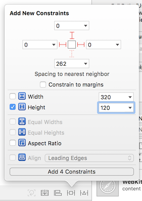
This will make the header view stick to the top of the screen and also having width of the screen size. The height constraint is set to the maximum height that the header view can be (as shown in the unscrolled state earlier), we can change the height constraint value in code when user scrolls the table view later.
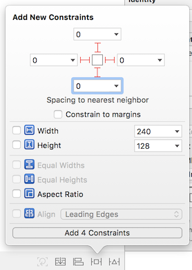
Next, we will add an image view (the cover image) inside the header view:
And add top (0) , leading (0), trailing (0) and bottom (0) constraints to it so it will have the same width / height as its parent view.
Use your favorite photo and put it as the image of the cover image view 😆.
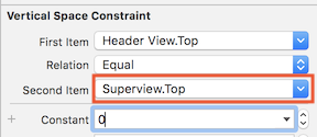
You would notice that the image is not sticked to top (there is some gap), this is because by default iOS will use safe area when creating constraint, let's change the top constraint to use Superview.top instead of Safe Area.
Double click the top constraint of the header view in size inspector :

Then change the "Safe Area .top" to "Superview.top". And also update the constant to "0".
We would also want the displayed image to not exceed the bounds of header container view, we can do this by checking the 'Clip to bounds' box.
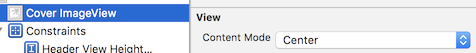
I prefer to use "Center" for the content mode of the Cover Imageview, so that the center portion of the cover photos will be focused, you can choose other content mode as you like.
If you build and run the app now, you will see the cover image nicely sticked on top but its height doesn't shrink when you scroll down, we will proceed to modify its height constraint in the next step.
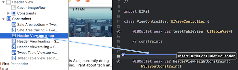
Select the Header View from the Document Outline list, and double click its height constraint under the size inspector tab. Then you should see the height constraint is being highlighed in the document outline.
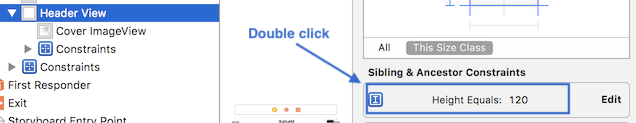
Control + Drag the height constraint to the view controller to create an outlet for it :
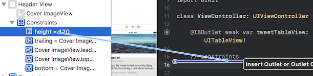
We will name the outlet as 'headerViewHeightConstraint' , it should have a type of NSLayoutConstraint.
Now we have created an outlet for the constraint, we can modify its value in the code. We would want its height to change when user scroll the tableview, so we will add some code in the scrollViewDidScroll delegate method.
First, when user pull down the table view (finger moving down), the height of the cover image should expand as well, the height of the cover image is increased using the distance scrolled of the user. The code to achieve this as below :
func scrollViewDidScroll(_ scrollView: UIScrollView) { // user finger is pulling down if(scrollView.contentOffset.y < 0){ // 120 is the original height of the header view headerViewHeightConstraint.constant = 120 - scrollView.contentOffset.y }}
scrollView.contentOffset.y is the distance the user has scrolled from the tableview original state. When user finger is pulling down, the value of contentOffset.y is negative (ie. if user has pulled down 60pt, its value is -60). Then we will update the header view height constraint value by subtracting this value.
eg: If user has pulled down 60pt,
- the
contentOffset.ywill be -60. 120 - scrollView.contentOffset.y=120 - (-60)=120 + 60= 180headerViewHeightConstraint.constant = 180- Cover image height increased to 180
Build and run the app, pull down the table view and you should see the cover image being expanded as well.
Next, we will add some code so that when user scrolls the table view, the cover image height will shrink (until a minimum size). If you observe how the cover image behave when scrolling down, you will notice that the image didn't seems like shrinking, it feels more like that the cover image is moving up as user scrolls. To achieve this effect, we will modify the value of the top constraint of the cover image container view.
Similar to the height constraint, we will create an outlet for the header view's top constraint and name it as 'headerViewTopConstraint'.
Then we will update the scrollViewDidScroll function by adding some code to change the top constraint value.
func scrollViewDidScroll(_ scrollView: UIScrollView) { // user finger is pulling down if(scrollView.contentOffset.y < 0){ // top constraint original value is 0, when user pull down, remain same headerViewTopConstraint.constant = 0 headerViewHeightConstraint.constant = 120 - scrollView.contentOffset.y } // user is scrolling down (finger moving up) if(scrollView.contentOffset.y >= 0){ headerViewHeightConstraint.constant = 120 if(scrollView.contentOffset.y < 60){ // move up the header view based on the distance scrolled headerViewTopConstraint.constant = -scrollView.contentOffset.y } else { // will be moved up by 60 pt at most headerViewTopConstraint.constant = -60 } }}
eg: If user has scrolled down 30 pt,
- the
contentOffset.ywill be 30 headerViewTopConstraint.constant = -scrollView.contentOffset.y=-30- Header view will be moved up by 30 pt.
eg: If user has scrolled down 60 pt or more,
headerViewTopConstraint.constant = -60- Header view will stay 60pt above its original position no matter how far the user has scrolled.
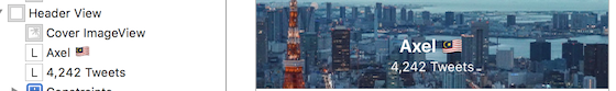
Build and run the app, now we have a stretchy header that will expand when the tableview is pulled down and move up when the tableview is scrolled. Almost there! Next, we will add labels (display name + number of tweets) that will appear when user continue to scroll further.
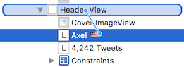
First, drag two labels into the Header View, and place it below the Cover ImageView in the Document outline, so that they will appear in front of the image view.
I used font System Bold 16.0 for the display name and System 12.0 for the number of tweets label.
Add constraints to horizontal center both the display name label and number of tweets label to the center of the Header View. Then add vertical spacing constraint between the display name label and number of tweets label, and set its value to 0.
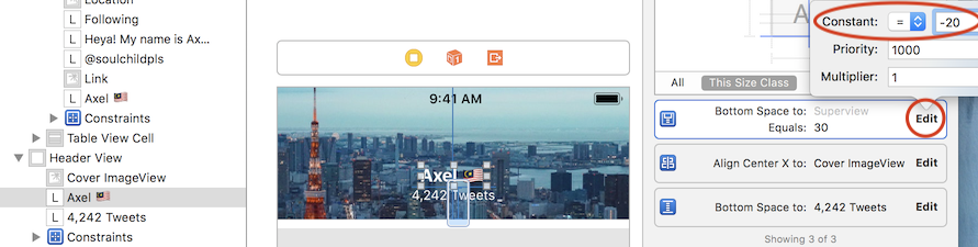
Next, create a constraint by control-dragging the display name label to the Header View, and select 'Bottom Space to Container'.
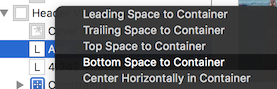
This will create a constraint from the display name label's bottom to the bottom of the Header View. What we are going to implement next is illustrated below:
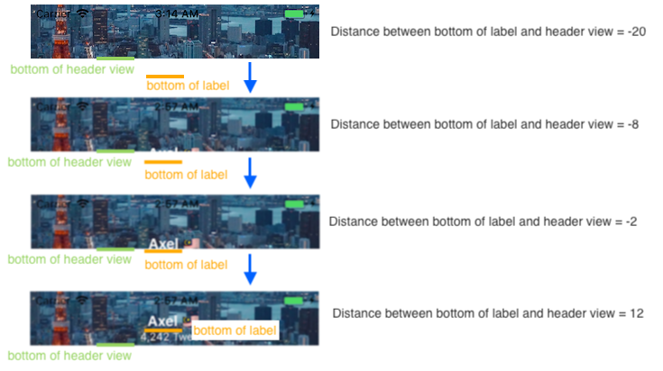
Select the bottom spacing constraint, and set its constant value to -20, so that the label will be underneath the header view (not visible). We will then update to value to positive when user scrolls the table view.
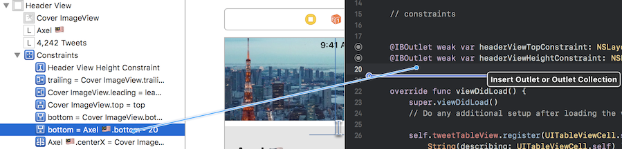
Next, we will create an outlet for the Bottom Space constraint by control dragging it to view controller. Let's name it as 'headerNameLabelBottomConstraint'.
We would want the display name label and number of tweets label to appear (rise up) only after user has scroll more than a certain distance. Let's set the distance as 100pt. We will then update the code in scrollViewDidScroll :
func scrollViewDidScroll(_ scrollView: UIScrollView) { // user finger is pulling down if(scrollView.contentOffset.y < 0){ headerViewTopConstraint.constant = 0 headerViewHeightConstraint.constant = 120 - scrollView.contentOffset.y } // user is scrolling down (finger moving up) if(scrollView.contentOffset.y >= 0){ headerViewHeightConstraint.constant = 120 if(scrollView.contentOffset.y < 60){ headerViewTopConstraint.constant = -scrollView.contentOffset.y } else { headerViewTopConstraint.constant = -60 } } // only adjust bottom constraint after user has scroll more than 100pt if(scrollView.contentOffset.y < 100.0) { headerNameLabelBottomConstraint.constant = -20.0 } else { headerNameLabelBottomConstraint.constant = -20.0 - 100.0 + scrollView.contentOffset.y // ensure that the display name label doesn't move too high if(headerNameLabelBottomConstraint.constant > 20.0) { headerNameLabelBottomConstraint.constant = 20.0 } }}
If user has scrolled the table view for less than 100pt , the display name label remain hidden (-20 from bottom).
If user has scrolled 130pt,
-20.0 - 100.0 + scrollView.contentOffset.y=-20.0 -100.0 + 130.0=10.0headerNameLabelBottomConstraint.constant= 10.0- display name label bottom will be 10.0pt away from the bottom of the header view, making it visible.
If user has scrolled 141pt or more,
-20.0 - 100.0 + scrollView.contentOffset.y=-20.0 -100.0 + 141.0=21.0headerNameLabelBottomConstraint.constant= 21.0 , and is > 20.0- Set back the
headerNameLabelBottomConstraint.constantto 20.0
The display name label will stay fixed with 20pt away from its bottom to the header view bottom no matter how far the user has scrolled.
Build and run the app, try scrolling down and you will see the header view's display name labels appear just after the display name label in Table header view is being hidden.
Phew, so far we have managed to implement the table view and header view. Next, we will implement the hardest part - Avatar of the user.
Constructing Avatar (Profile picture)
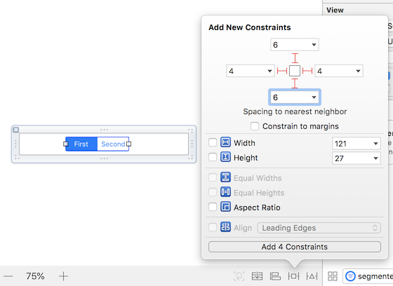
First, drag a view and place it in front of header view (below the Header View in Document Outline). Let's name it as 'Avatar Container View'.
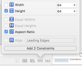
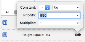
Add height constraint of 64 pt and an aspect ratio constraint to it.
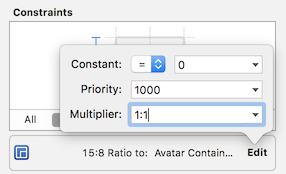
After creating these constraints, open the Size Inspector tab and edit the Aspect Ratio constraint to 1:1, meaning the width will equal to the height.
Next, we will control-drag the avatar container view to the header view, and create an align bottom constraint:
And change the value of the bottom constraint to 34 :
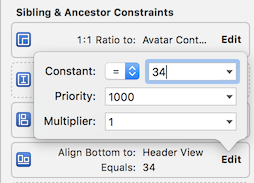
This will make the bottom of the avatar to have 34 pt from the bottom of the header view.
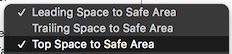
Next, control + drag the avatar container view to the view controller's root view :
And select Leading Space and Top Space to Safe Area constraint (hold Shift key to select multiple constraints)
Change the constant value of the leading space constraint to 16.
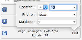
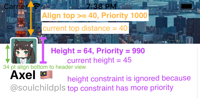
Change the constant value of the top constraint to 40, and change the "=" to ">=" , which makes it to "equal or larger than 40".
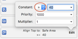
At this point, you should see that there is 5 constraints for the Avatar container view like this:
Now, we will decrease the priority of the height constraint from 1000 to 990, so it can be ignored when user scroll down. Remember that the avatar image size will shrink and then hide behind the header view? We can achieve the shrinking effect without using code by just using constraint priority, which will be explained later.
Don't forget to put in the Image View for the Avatar into the Avatar Container View :
Here is the constraints for the avatar image view, this creates a padding between the edge of the container view. Top (2), Leading (2), Trailing (2), Bottom (2).
Below are the explanation on what will happen to the avatar when user scrolls the table view :
- Original state, user haven't scroll yet. Top distance can be more than 40 as the constraint is larger or equal to 40. The bottom of the avatar will stick to 34pt away from the bottom of Header view.
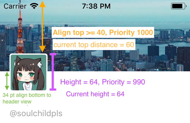
- User has scrolled down 20 pt. Top distance become 40.
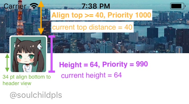
- User continue to scroll further, Auto Layout will then ignore the height constraint as it has lower priority in order to fulfill the Top constraint and also the bottom constraint towards the Header View. This will make the height shrink as the avatar container view need to fulfill the constraint of aligning its bottom to 34pt away from the header view (priority 1000).
The 1:1 ratio constraint comes in handy as Auto Layout will shrink the width to be equal of the height as user scrolls.
Build and run the app, try scrolling the table view and you will see that the avatar shrink when you scroll down, and revert back to its original size when you scroll up, neat right?
As you scroll down, although the avatar size did shrink, it didn't move up and slip into the back of the Header View. We are going to implement these effect next.
Since we are going to move up the avatar, we will need to create constraint outlet for the Avatar container view 's Align Top constraint (to Safe Area) and Align Bottom constraint (to Header View).
Select the Avatar Container View, and double click these constraints as shown in Size inspector tab :
and control-drag it to the view controller to create constraint outlet :
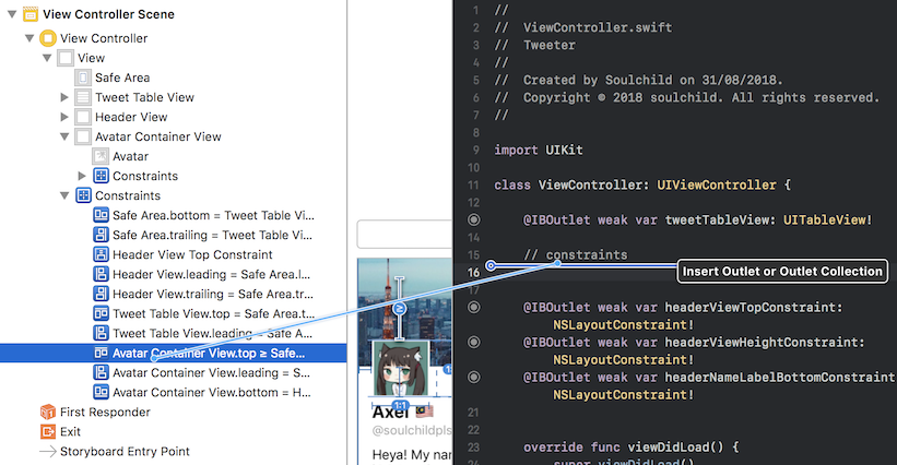
We will name the align top constraint as avatarContainerViewAlignTopConstraint, and the align bottom constraint as avatarContainerViewAlignBottomConstraint.
Similar to other constraint outlets we have previously created, we will modify their value in scrollViewDidScroll .
func scrollViewDidScroll(_ scrollView: UIScrollView) { // user finger is pulling down if(scrollView.contentOffset.y < 0){ headerViewTopConstraint.constant = 0 headerViewHeightConstraint.constant = 120 - scrollView.contentOffset.y } // user is scrolling down (finger moving up) if(scrollView.contentOffset.y >= 0){ headerViewHeightConstraint.constant = 120 if(scrollView.contentOffset.y < 60){ headerViewTopConstraint.constant = -scrollView.contentOffset.y // if the scrolling distance is lesser than 60pt, // leave avatar container view constraints as their original value avatarContainerViewAlignTopConstraint.constant = 40.0 avatarContainerViewAlignBottomConstraint.constant = 34.0 } else { headerViewTopConstraint.constant = -60 // if the scrolling distance is more than 60pt, // move up the value of top constraint and bottom constraint, // thus making the avatar container to move up avatarContainerViewAlignTopConstraint.constant = 40.0 + 60.0 - scrollView.contentOffset.y avatarContainerViewAlignBottomConstraint.constant = 34.0 + 60.0 - scrollView.contentOffset.y } } // only adjust bottom constraint after user has scroll more than 100pt if(scrollView.contentOffset.y < 100.0) { headerNameLabelBottomConstraint.constant = -20.0 } else { headerNameLabelBottomConstraint.constant = -20.0 - 100.0 + scrollView.contentOffset.y if(headerNameLabelBottomConstraint.constant > 20.0) { headerNameLabelBottomConstraint.constant = 20.0 } }}
If user has scrolled 40 pt,
contentOffset.y= 40, which is lesser than 60avatarContainerViewAlignTopConstraint.constantwill set to 40 , which is the original value we set in the Interface BuilderavatarContainerViewAlignBottomConstraint.constantwill set to 60, which is the original value we set in the Interface Builder- At this point the avatar hasn't shrink to its smallest possible size yet, hence it does not need to move upward
If user has scrolled 60pt,
contentOffset.y= 60, which is not lesser than 60avatarContainerViewAlignTopConstraint.constant= 40.0 + 60.0 - (scrollView.contentOffset.y) = 40.0 + 60.0 - 60.0 = 40.0 (which is the same as the original value in Interface Builder)avatarContainerViewAlignBottomConstraint.constant= 34.0 + 60.0 - (scrollView.contentOffset.y) = 34.0 + 60.0 - 60.0 = 34.0 (which is the same as the original value in Interface Builder)- At this point the avatar has just shrinked to its smallest possible size, if user continue scroll past 60pt, it should start moving upwards.
If user has scrolled 80pt,
contentOffset.y= 80, which is not lesser than 60avatarContainerViewAlignTopConstraint.constant= 40.0 + 60.0 - (scrollView.contentOffset.y) = 40.0 + 60.0 - 80.0 = 20.0avatarContainerViewAlignBottomConstraint.constant= 34.0 + 60.0 - (scrollView.contentOffset.y) = 34.0 + 60.0 - 80.0 = 14.0- At this point the avatar has already shrinked to its smallest possible size, and its align top constraint is reduced from the original 40.0 to 20.0
- The distance from the avatar bottom to the header view bottom is reduced from 34.0 to 14.0.
- As both the top and bottom constraint has reduced by 20pt (ie. moved up 20pt), the avatar will move up 20pt.
The avatar container view will move up X pt (eg: 20pt) when user has scrolled 60 + X pt (eg: 80pt).
Here's explanation on how the change of top and bottom constraint's value will move the avatar up :
There you have it! Build and run the app, scrolls the table view and you will see that the avatar shrinks and move up. It looks good now except it doesn't slip behind the header view when it move up 🤔.
To send the Avatar container view to the back of Header View, there's sendSubviewToBack (https://developer.apple.com/documentation/uikit/uiview/1622618-sendsubviewtoback) method for the UIView class. There's also bringSubviewToFront method that can put Header View in front of Avatar container view. These methods are useful for arranging front/back of view, but I find modifying Z position property of the view to change front/back position is easier to implement for this case.
Z position is a CALayer property which controls the view layer’s position on the z axis. Higher values of Z position will place the layer visually closer to the viewer than layers with lower values. The default value of Z position is 0. (https://developer.apple.com/documentation/quartzcore/calayer/1410884-zposition).
When the view controller first load, Avatar will be in front of the Header view, meaning Avatar have a higher zPosition value than Header view. After the Avatar has shrinked to its smallest possible size and start moving up, Avatar will be behind the Header view, meaning the zPosition value of the Avatar is lower than Header View at that time.
Original state :
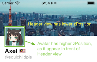
After avatar shrinked to its smallest possible size and move up :
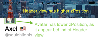
Before implementing the zPosition code, create an IBOutlet for the Avatar Container View (control drag it to the view controller) and name it as avatarContainerView. And also create an IBOutlet for the Header View, and name it as headerView.
Let's start implementing this zPosition. Go to viewDidLoad , and set the default zPosition value for Avatar Container View and Header View :
override func viewDidLoad(){ ... // set default z-index for header view and avatar container view // avatar appear in front of header view originally, hence its larger value self.headerView.layer.zPosition = 1 self.avatarContainerView.layer.zPosition = 2}
The zPosition of the Avatar Container view will be decreased right after it shrinks to its smallest size.
Now in the scrollViewDidScroll , we will add code to modify the zPosition values :
func scrollViewDidScroll(_ scrollView: UIScrollView) { // user finger is pulling down if(scrollView.contentOffset.y < 0){ headerViewTopConstraint.constant = 0 headerViewHeightConstraint.constant = 120 - scrollView.contentOffset.y } // user is scrolling down (finger moving up) if(scrollView.contentOffset.y >= 0){ headerViewHeightConstraint.constant = 120 if(scrollView.contentOffset.y < 60){ headerViewTopConstraint.constant = -scrollView.contentOffset.y avatarContainerViewAlignTopConstraint.constant = 40.0 avatarContainerViewAlignBottomConstraint.constant = 34.0 // Avatar grows back to normal size // move avatar to the front if it is behind the header view if(avatarContainerView.layer.zPosition < headerView.layer.zPosition){ avatarContainerView.layer.zPosition = 2.0 headerView.layer.zPosition = 1.0 } } else { headerViewTopConstraint.constant = -60 avatarContainerViewAlignTopConstraint.constant = 40.0 + 60.0 - scrollView.contentOffset.y avatarContainerViewAlignBottomConstraint.constant = 34.0 + 60.0 - scrollView.contentOffset.y // Avatar container view beginning to move up (and slip to behind of header view // Move avatar to behind header View if(avatarContainerView.layer.zPosition > headerView.layer.zPosition){ avatarContainerView.layer.zPosition = 1.0 headerView.layer.zPosition = 2.0 } } } // only adjust bottom constraint after user has scroll more than 100pt if(scrollView.contentOffset.y < 100.0) { headerNameLabelBottomConstraint.constant = -20.0 } else { headerNameLabelBottomConstraint.constant = -20.0 - 100.0 + scrollView.contentOffset.y if(headerNameLabelBottomConstraint.constant > 20.0) { headerNameLabelBottomConstraint.constant = 20.0 } } }
Build and run the app, scrolls the table view and voila! You will see the Avatar shrinks and slip behind the Header view. You have implemented the Twitter profile UI successfully! Yay! 🎉 Give yourself a pat on the back if you have followed this far.
Finishing Touch
Since the Avatar has rounded corner, we can add it by using the cornerRadius property. Create an outlet for the Avatar Image View and name it as avatarImageView, and add the following code in viewDidLoad :
override func viewDidLoad() { // ... // set rounded corner for avatar self.avatarContainerView.layer.cornerRadius = 6.0 self.avatarImageView.layer.cornerRadius = 4.0 self.avatarImageView.layer.masksToBounds = true}
Adjusting for iPhone X / XS / XR
If you build and run the app on an iPhone X Simulator, you will notice that the display name label is blocked by the notch on top 😱 :
We will need to increase the height of the header view using the safe area top margin (inset) provided by Apple.
We will need to modify the constant value of self.headerViewHeightConstraint .
In the top of ViewController.swift, add this two variable :
xxxxxxxxxxclass ViewController: UIViewController { .... // 120 for non X phone var headerViewHeightConstraintOriginValue : CGFloat = 120.0 // ensure that the height constraint is only adjusted once // since viewDidLayoutSubviews will get called multiple time when user scroll the tableview var hasAdjustedConstraint = false ...}
Edit the viewDidLayoutSubviews() function:
x
override func viewDidLayoutSubviews() { super.viewDidLayoutSubviews() // the safe area margin created by Apple to cater for rounded corner screen let safeAreaInsets = UIApplication.shared.keyWindow!.safeAreaInsets // starting from iOS 12.0, iPhone SE and iPhone 6,7,8/plus has a 20 pt top safe area inset // whereas iPhone X/XS/XR has a 44pt top safe area inset. // we only want to adjust the insets on X/XS/XR screen if(!hasAdjustedConstraint && safeAreaInsets.top > 20){ // add half of the top margin space to the height of header view self.headerViewHeightConstraintOriginValue += safeAreaInsets.top / 2.0 self.headerViewHeightConstraint.constant = self.headerViewHeightConstraintOriginValue hasAdjustedConstraint = true } self.adjustTableHeaderViewSize(tableView: self.tweetTableView)}
And in the scrollViewDidScroll function, replace 120 with headerViewHeightConstraintOriginValue .
x
func scrollViewDidScroll(_ scrollView: UIScrollView) { // user finger is pulling down if(scrollView.contentOffset.y < 0){ headerViewTopConstraint.constant = 0 // replace 120 with headerViewHeightConstraintOriginValue headerViewHeightConstraint.constant = headerViewHeightConstraintOriginValue - scrollView.contentOffset.y } // user is scrolling down (finger moving up) if(scrollView.contentOffset.y >= 0){ // replace 120 with headerViewHeightConstraintOriginValue headerViewHeightConstraint.constant = headerViewHeightConstraintOriginValue if(scrollView.contentOffset.y < 60.0){ ....
Build and run the app again, scroll and you should see the display label is positioned nicely 🙌.